Overview
Adobe Express is an all-in-one content creation platform made to empower users without design experience.
The product, however, is often overshadowed by industry leader Canva. And so, Adobe's education team challenged us, Product Space, a student led product consultancy, to address their key concern for Express:
Driving Question
How do we make Adobe Express relevant to college students in the US?
As both project and product design lead, my role was to spearhead market research, user interviews, design iteration, and of course make our slides look pretty 😅. After months of work, I'm so excited to share what we accomplished.
Spoiler Alert
A sneak peek into our impact
Landing Page
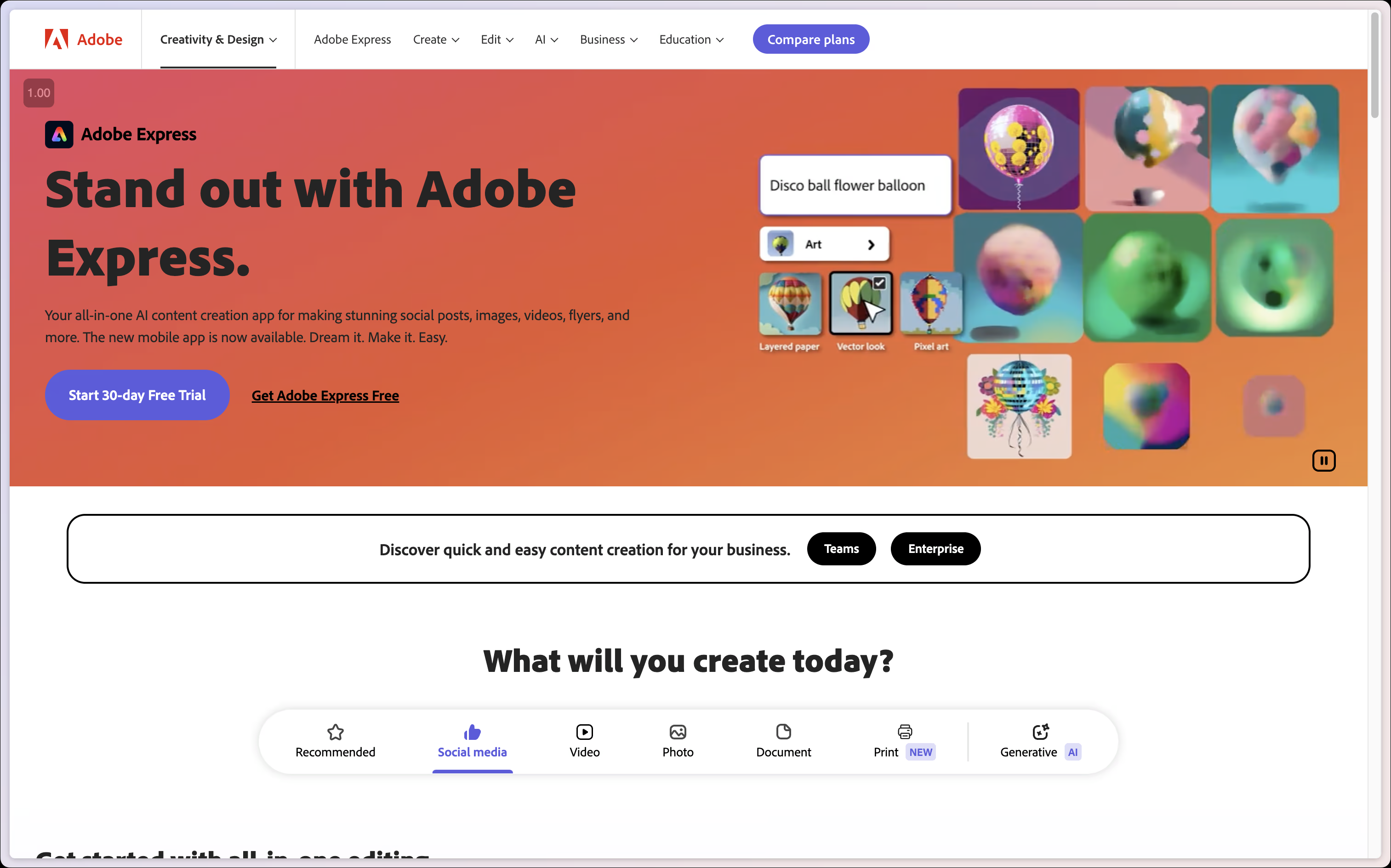
Before
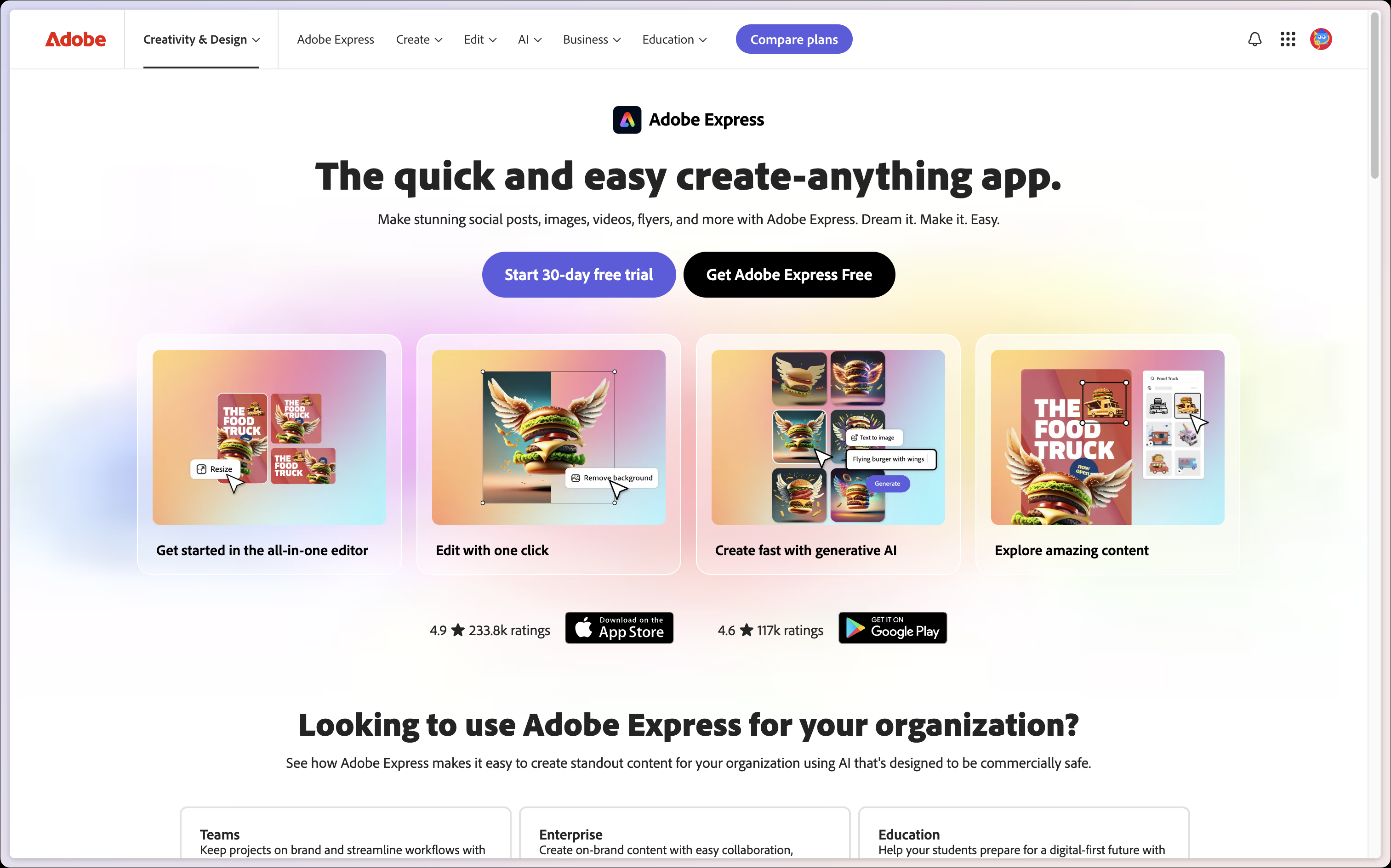
After
Workspace Entry
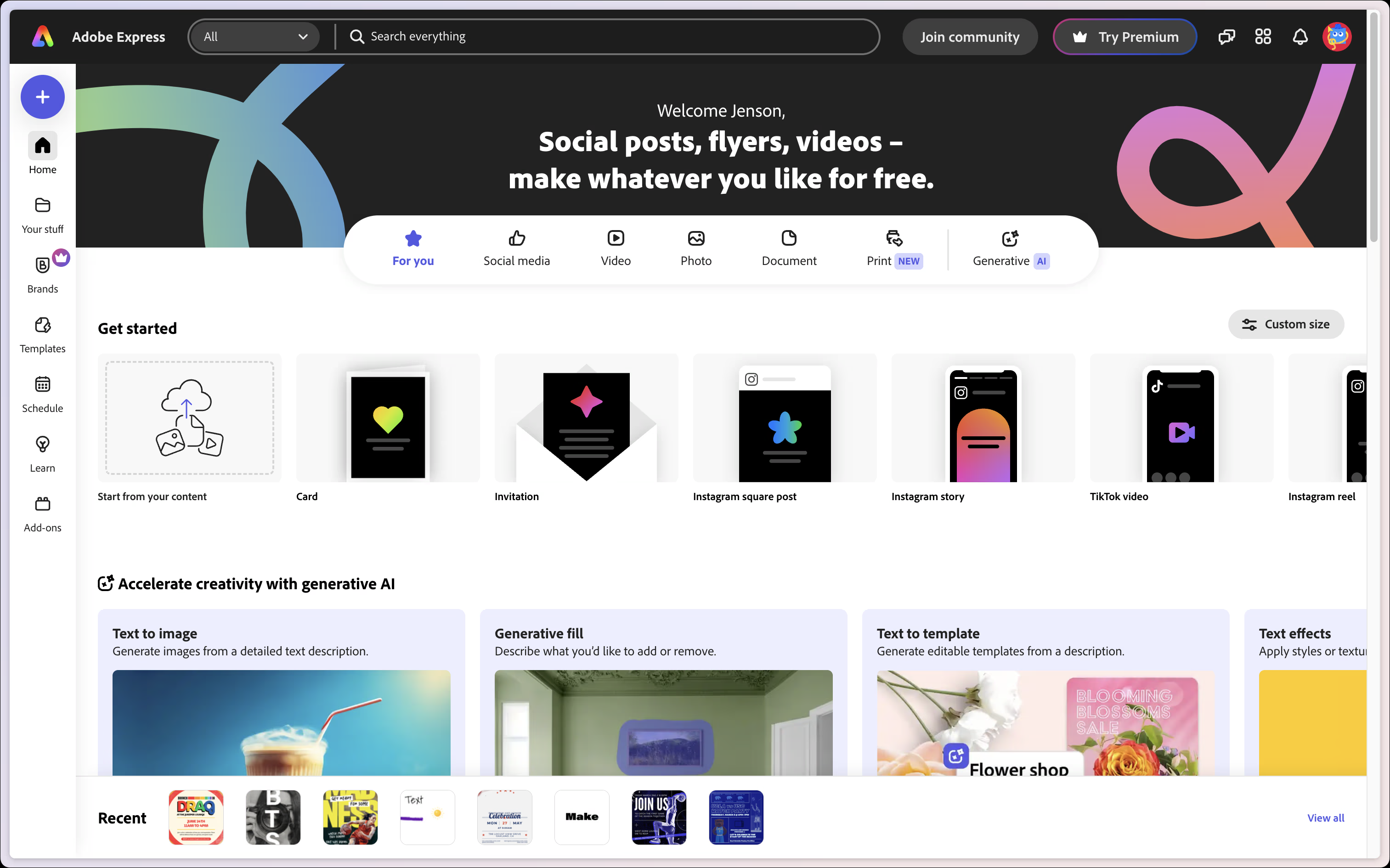
Before
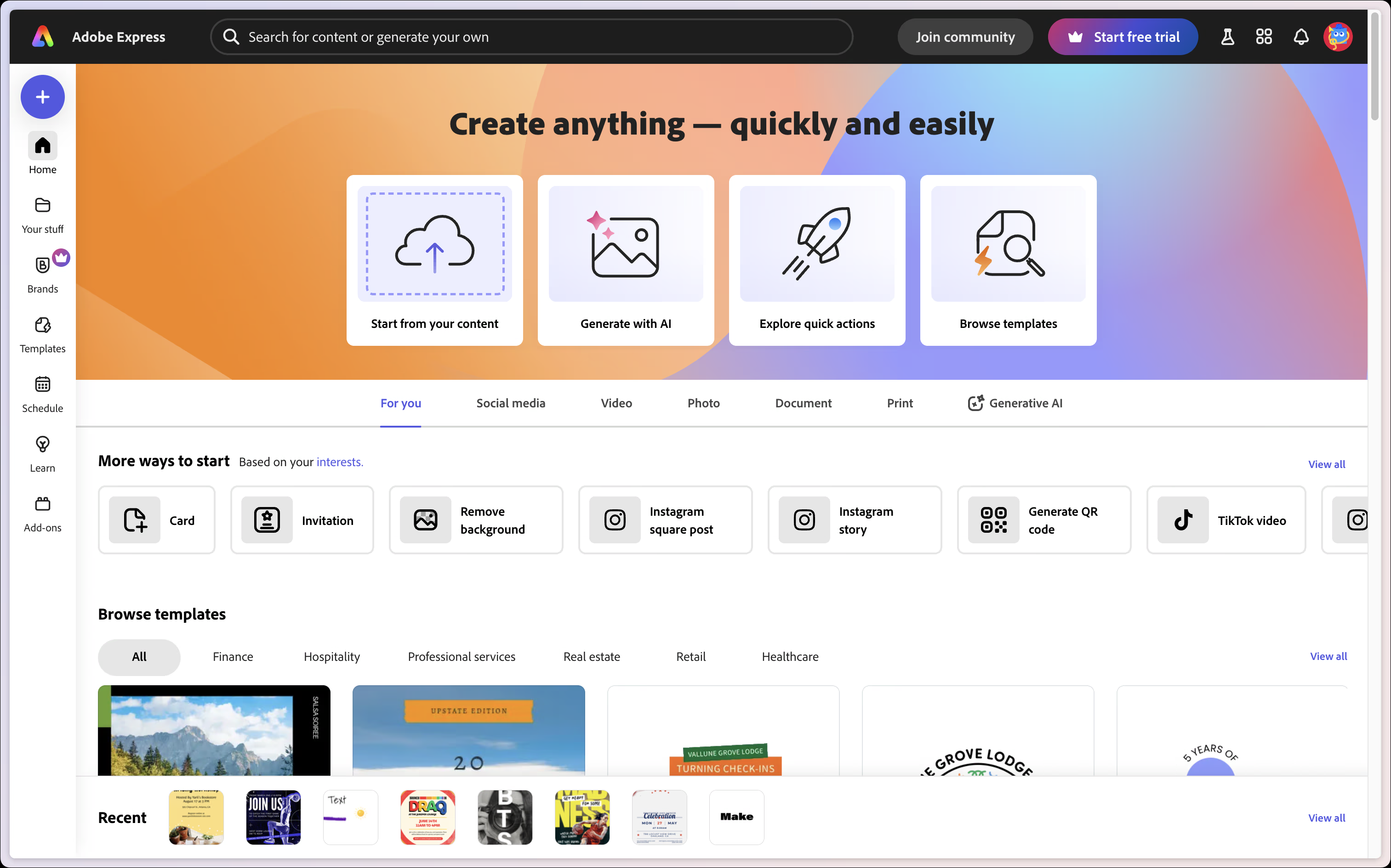
After
Text Editor
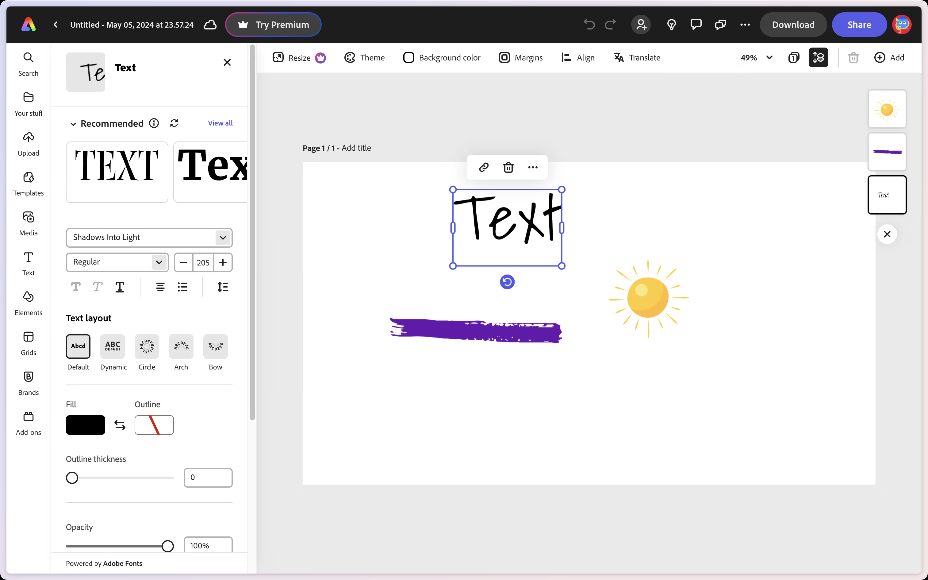
Before
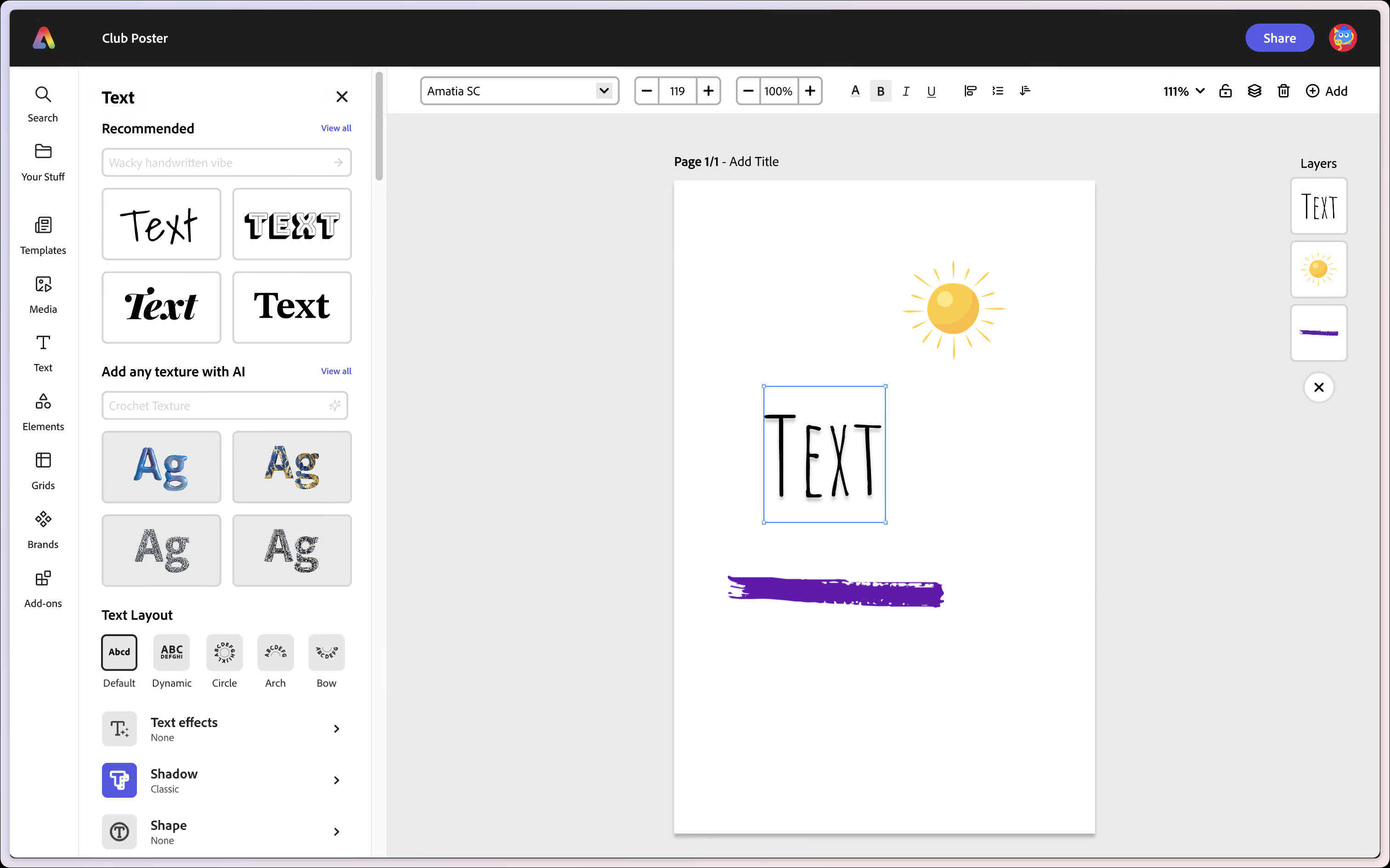
After
Process
How Did We Get Here?
📝 Research
🧠 Synthesize
🧑🏼💻 Design
💡 Recommendations
Across the 10 weeks of the project, these were the four major stages that we went through to ensure that all of our final recommendations were insightful and data-driven.
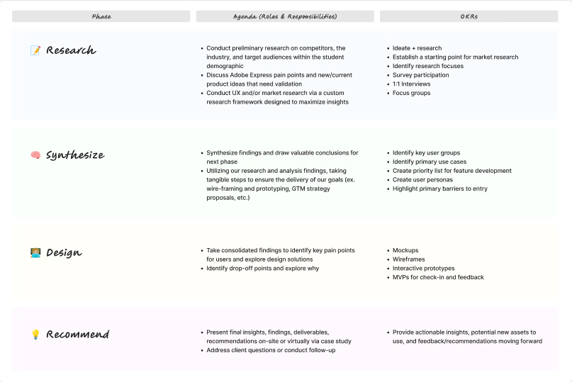
Our project plan/roadmap
Research
Asking The Right Questions
Coming into the project, most of our team had never heard of Express in the past, including myself. Naturally, we had lots of questions. For some context, before starting the project, this was a mindmap I made about all of my initial thoughts.
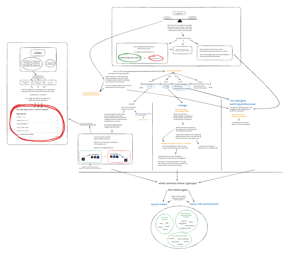
Adobe Express initial thoughts and considerations mindmap
Guiding Questions
- How and why are students creating content?
- What value do students find in Express and other similar products?
- Why aren't more students using Express?
In an overarching sense, these were questions we identified as key in order to make insightful recommendations. But, with such a large problem space, we had to get more specific.
We already knew that Express was getting dominated by industry leader Canva in market share, but why? Was their product just better? Did they have cooler features? Was it their brand image? Their marketing?
Here's what a quick Google search told us.
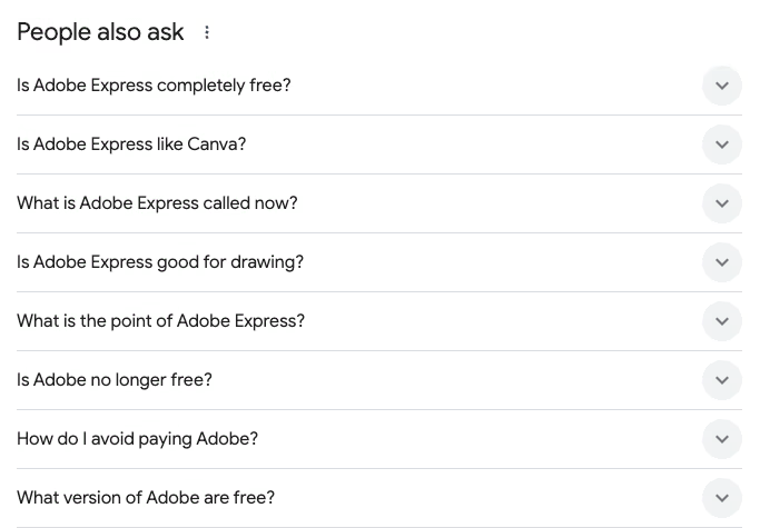
Adobe Express FAQ on Google
Awareness and Affordability
Of the eight most frequently asked questions about Adobe Express, four of them were about pricing. The rest seemed to stem out of a general confusion about what the product even was as a whole.
And so, we were immediately able to identify awareness and affordability as two of the core problems we had to address. This was especially the case because Adobe Express Premium is free to use for college students.
The results from our self-conducted research seeemed to point us in the same direction. After administering a survey to 361 students across university campuses in California, we found that:
Express Awareness
Canva Awareness
Converting Users: There's Still Hope!
But despite this, there didn't seem to be a strong lock-in effect. In fact, we found that even though
Express Usage
Willingness to Switch
This signalled to us that Canva and Express lacked enough differentiation to make brand/product loyalty a significant factor. As a designer, this was exciting news because it meant that if we could clear up the confusion around the product, minimize pain points, and optimize for the user experience, there was a large market gap there for the taking.
Express Barriers to Entry
Student responses when asked: Why have you never used Adobe Express before?
When we asked the users who had heard of Express why they hadn't considered trying it before, we recognized the same two issues of awareness and affordability. There was, however, also a third issue of perceived complexity, which participants indicated to us came largely from their past use of other Adobe products like PhotoShop, Illustrator, etc.
Humanizing the Numbers
Beyond the stats about willingness to switch and awareness and misconceptions and everything else, we wanted to get more human. How would a tool like Express fit into a student's workflow? What value would it add to their life?
To segment our users, we split them into 3 categories based on our survey results
⭐️ Users with no experience with Adobe Express or other content creation tools
⭐️⭐️ Users with some experience with content creation but not in Adobe Express
⭐️⭐️⭐️ Users experienced in Adobe Express & other content creation tools
and identified product/feature opportunities based on each type of user.
Inexperienced User Persona
For the inexperienced user making one-off posters and graphics, the most important factor for them is ease of us. For them, complicated paid software designed for porfessionals is daunting. All they need is something quick and easy.
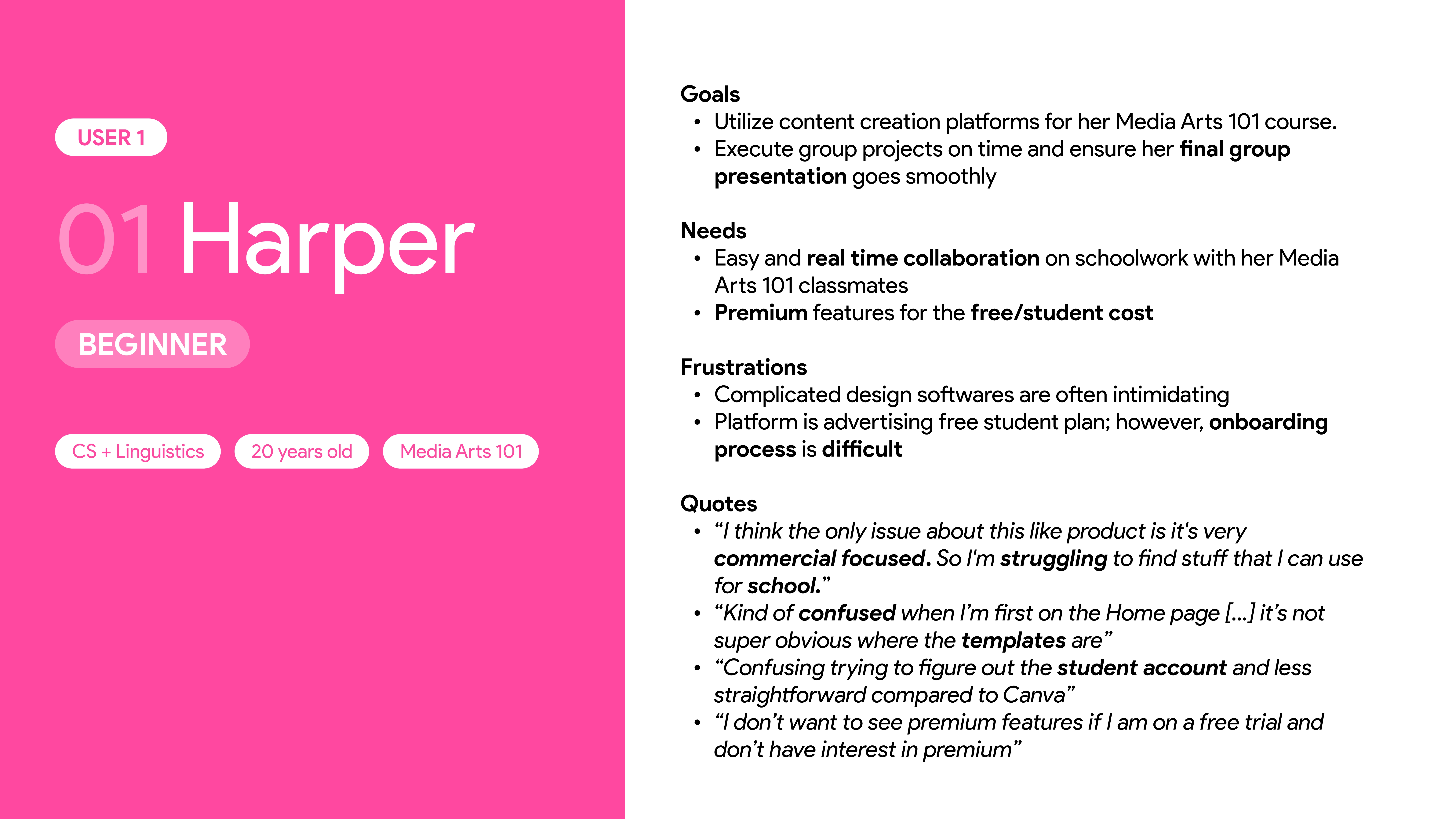
Inexperienced user persona
Minimally-Experienced User Persona
For users who already have some experience in design or with using other design tools, they're alerady familiar with the general capabilities and features that are available in Express. These users are most prone to skepticism within Express. Because of their familiarity with other tools, any minor roadblock or confusion will lead to extra likelihood of drop-off.
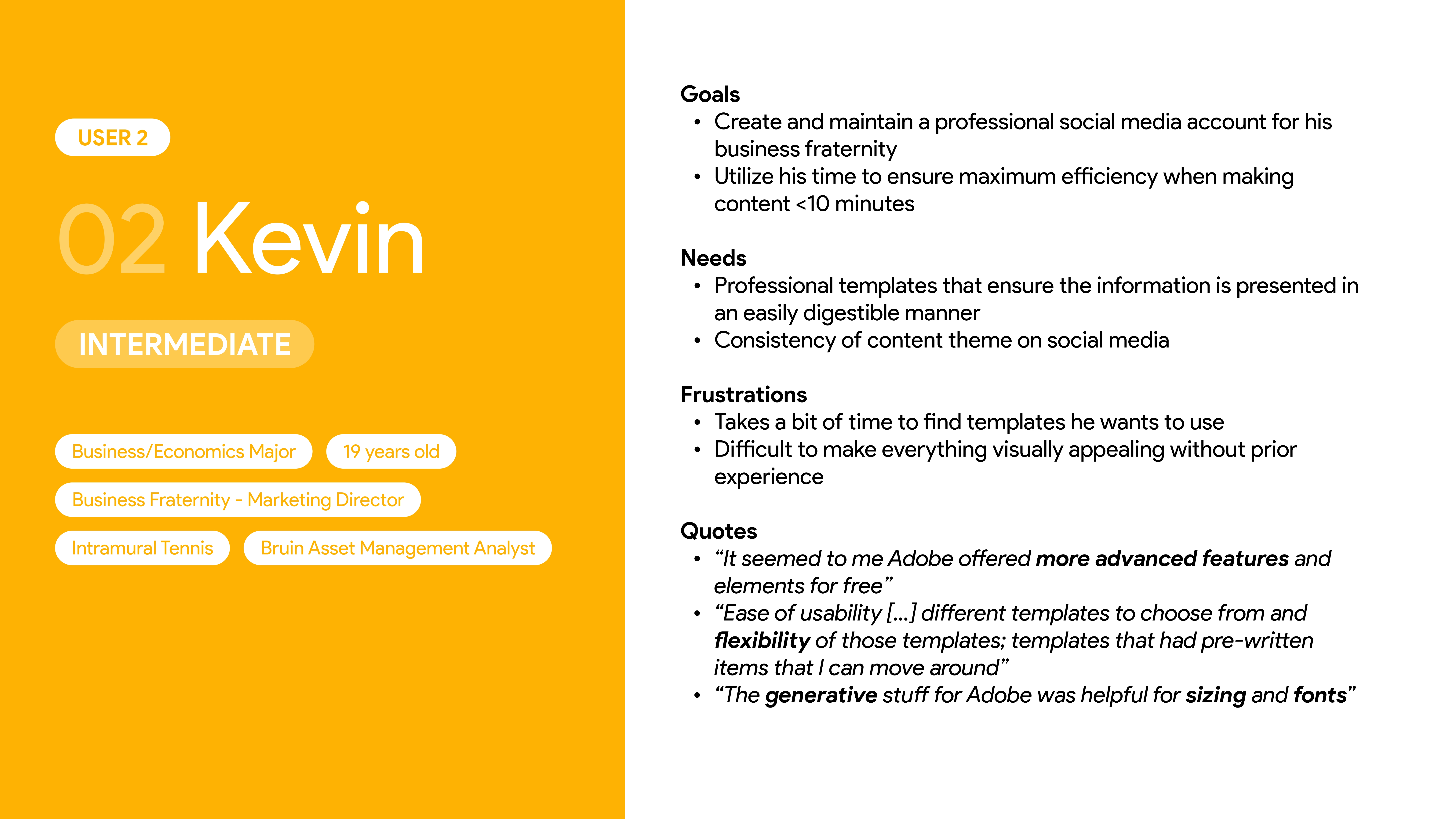
Minimally experienced user persona
Experienced User Persona
For experienced power users, they have no troubles navigating/using design tools. What's most important for a user like this is differentiating key features. Extra bonuses like Adobe suite integration or AI design generation are most likely to benefit this kind of user.
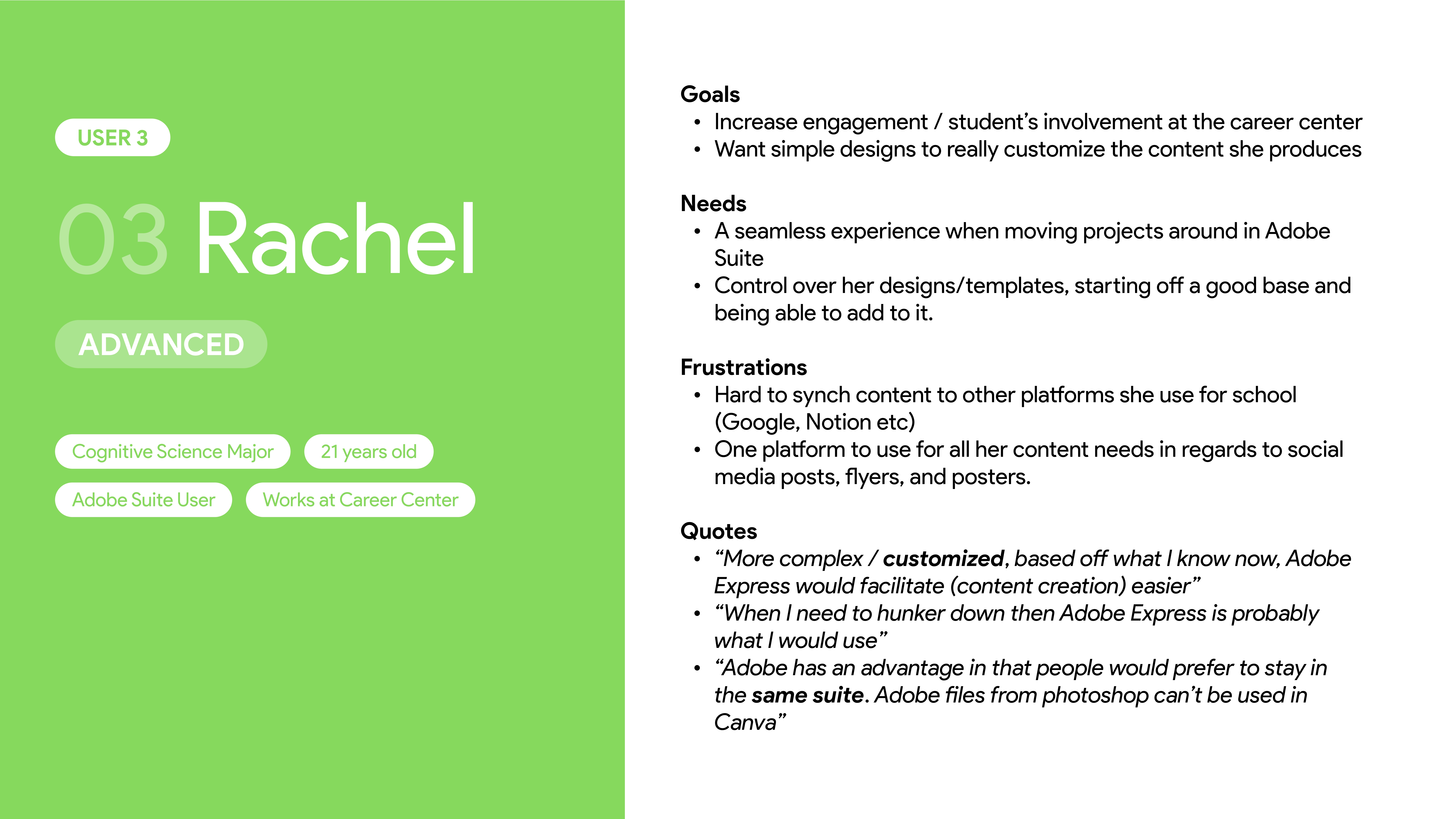
Experienced persona
Use Cases
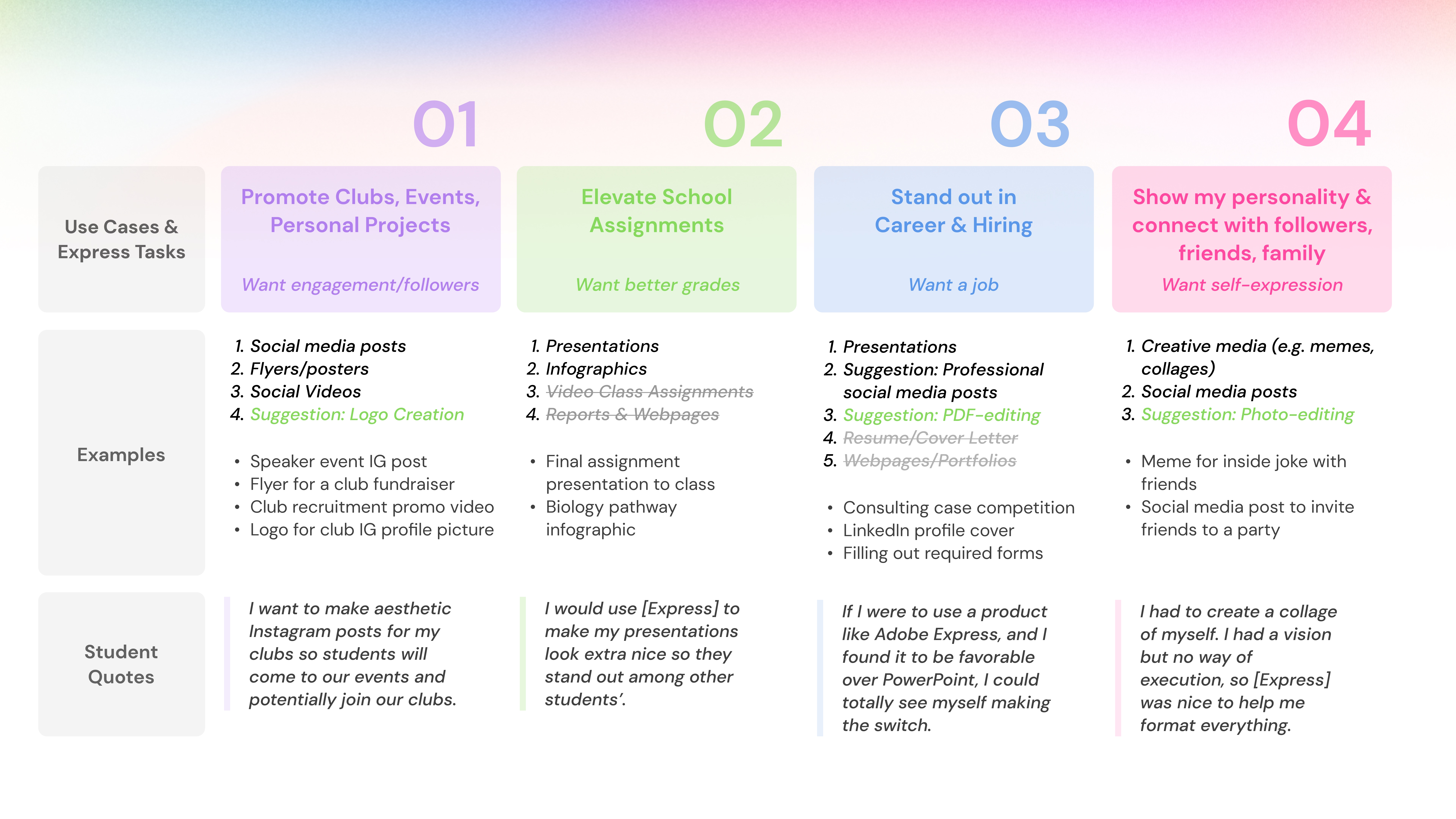
Express use cases diagram
In terms of what these users would actually be using Express to do, these were the 4 different segments we identified. For each of the segments we also outlined what exactly students want to achieve through their content creation and what kind of content they would create to do so.
Talking to Users

Screenshots from our hands-on user interviews
To build on top of our survey data, we also wanted qualitative data to inform our design decisions. And after interviewing 28 college students from a variety of academic backgrounds, we were even more sure of the problems we had to address.
Interview Structure
We tasked participants to make a poster promoting a college club related event with both Canva and Adobe Express. Throughout the interview, we kept an eye out for obvious roadblocks or confusion. Afterwards, we asked clarifying questions about their experience and also sent out a post-interview survey.
The interviews showed us that users loved the Express product. In fact, the large majority of users indicated in their post-survey responses that they would use Express over Canva in the future.
🟢 "The image uploader on this is way better than Canva ... Canva’s is super annoying."
🟢 "I think that feature is really really cool I’ve never seen that before ... that feature I thought was the best part" - Ability to change template sizing based on Instagram post versus flyer/story
🟢 "It’s like Canva but better, I thought it would be way harder to use than it was."
However, in line with our previous findings, we found that over 90% of the interviewees were completely unaware that they had free access to premium Express features. Troublingly, we noticed that users were confused about pricing even when interacting with the product, often leaving us to have to step in and answer clarifying questions.
🔴 "Do I have to pay for this?"
🔴 "I didn't know the premium features were free for students. I would definitely use [Express] if I knew that."
🔴 "Canva has an education plan, which is free, so I usually use that instead."
🔴 "I actually have never heard that Premium Adobe Express is offered for free for UCLA students."
Synthesis
Nailing First Impressions
Ultimately, what we gathered from our research was that if we could get users to go through the entire process of onboarding, creating, and exporting in Express, they'd be likely to come back to it over Canva.
The issue, however, lied in the fact that the experience wasn't seamless enough for users to get through the process themselves. Our user interviews, despite the overaching positive sentiment, were littered with small moments of confusion.
⁉️ "Wait how do I start using it?" - Referring to the landing page
💬 "I think editing the text on my flyer was a bit overwhelming because there was so much going on."
😵💫 "This whole screen is a little odd."
� "I think they need to specify what each icon means ... It's kind of frustrating that I have to click to find out."
Whilst these individual mini obstacles didn't seem to be a big deal in the moment, the aggregate analysis showed us that creating the same poster on Express took over 22% longer than doing it on Canva, leading us to believe that many users would drop-off if not for the interview environment.
To keep users on the platform, the experience had to be easier, smoother, more intuitive, and more familiar. We had to nail the first impression. The biggest thing we wanted to avoid was losing a user and having them leave feeling like this:
😣 "I don't really know what to do. Not going to lie at this point I would just give up and go back to Canva."
Design
Quick and Simple
Based on our research findings, we made it our primary goal to make recommendations that would optimize for speed and simplicity. In general, we tried our best through design to reduce cognitive load and ensure a smooth progression throughout. Once again, we wanted to cut out any of the confusion that would lead a user to leave Express.
Landing Page
Audit
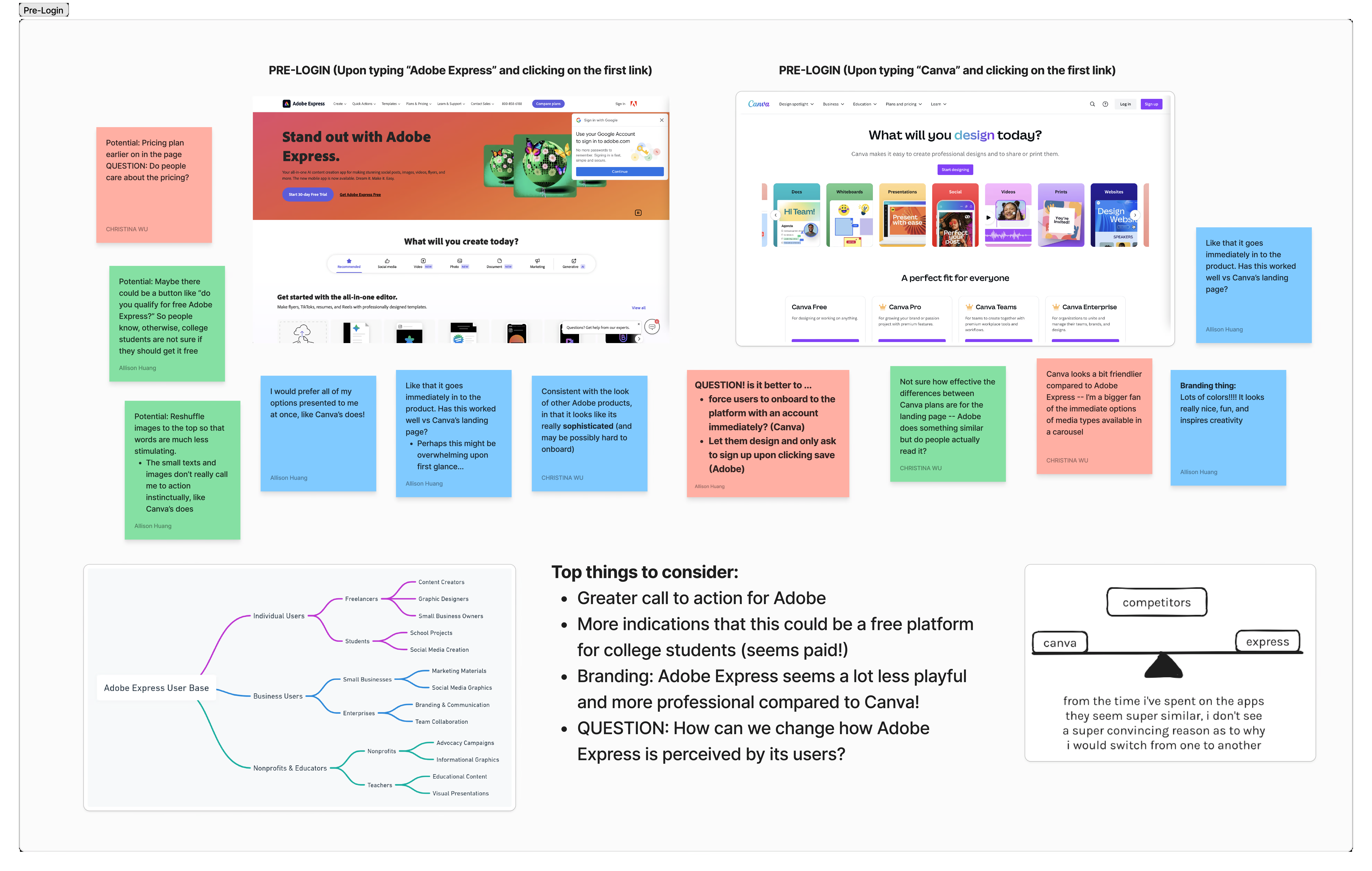
Landing page design audit
Key Takeaways
- Students should understand that they have free access to Express
- Users should be able to look at the landing page and have a clear idea of what Express can do
- There should be an emphasis on Express as a beginner-friendly tool, unlike the rest of Adobe's suite
Supporting Quotes
"Do I have to pay for this?"
"Adobe suite is definitely not the easiest to pick up"
"Canva feels a lot more approachable compared to this"
"What am I supposed to do from here? I'm confused"
Ideation
Here, we wanted to make it feel less cluttered to reduce the cognitive load for the user. We also spent lots of time brainstorming different ways to ensure that we could clearly communicate pricing and availability.
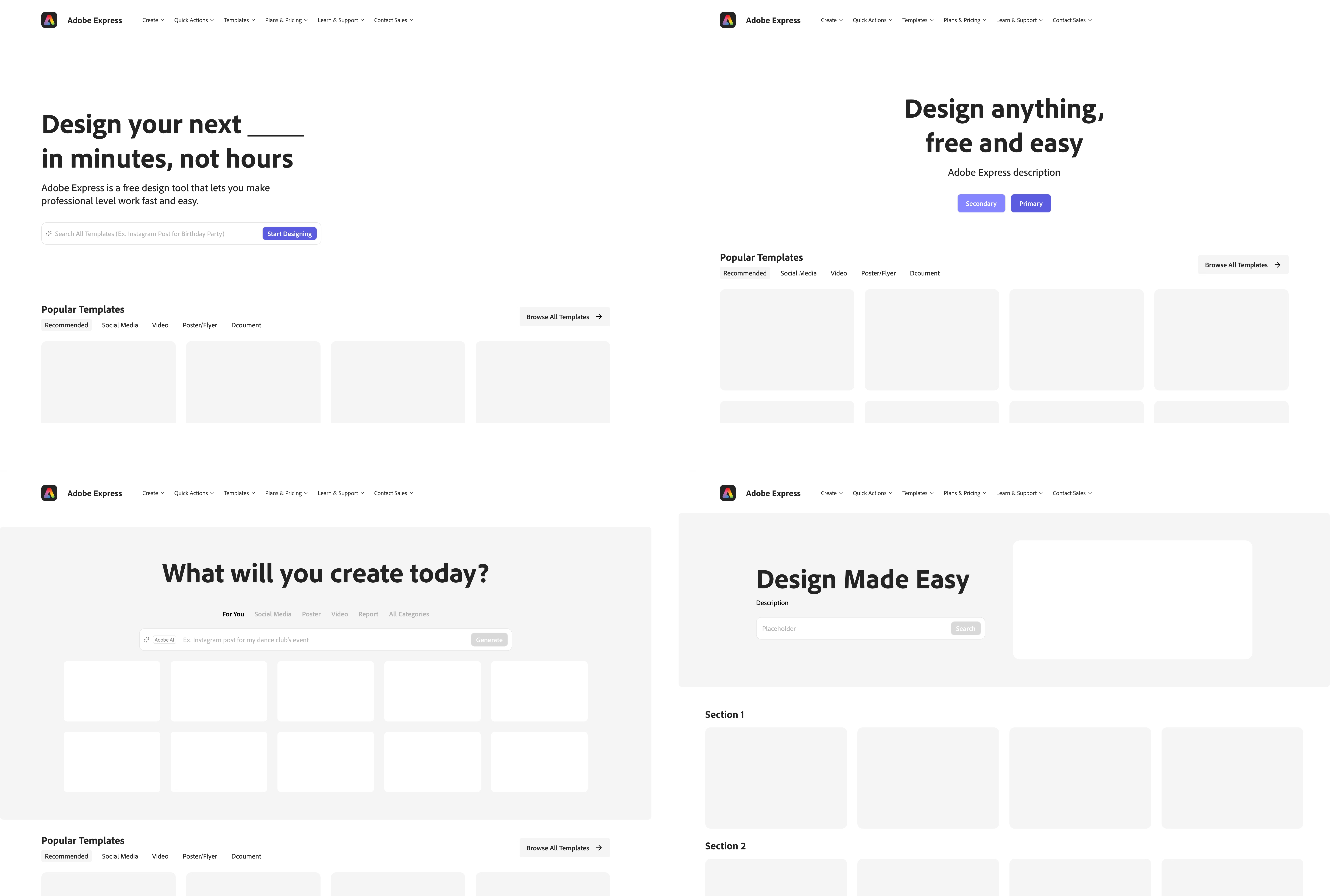
Landing page low fidelity wireframes
Final

Final landing page design

Before

After
Workspace Entry
Audit
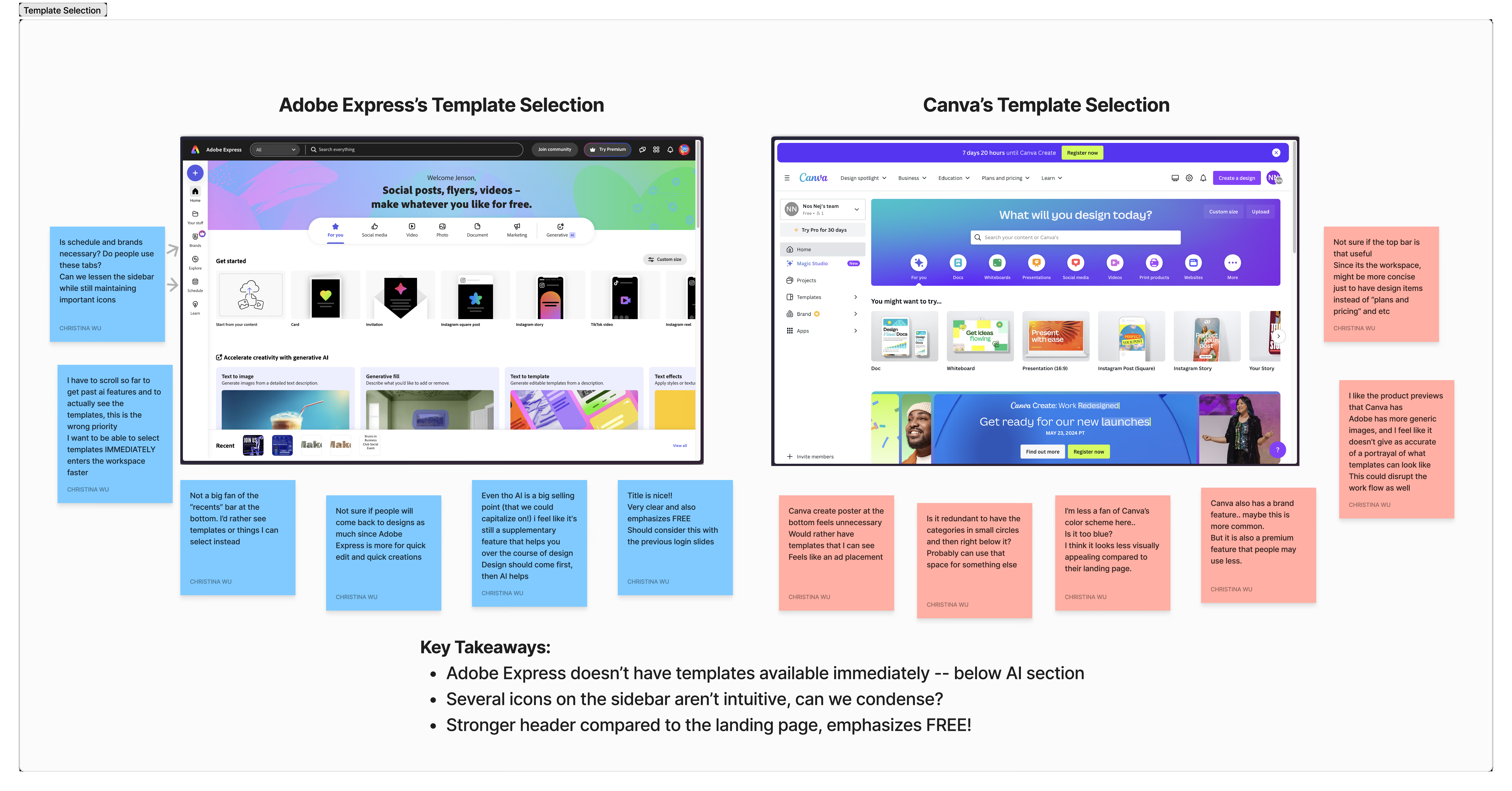
Workspace entry design audit
Key Takeaways
- Templates should be the number one priority on this page.
- AI, image editing, and other supplementary tools should come second to creating a design.
Supporting Quotes
"Where are the templates?"
"I wish I could see more of them at once"
"The templates are the most important thing for me when I use a tool like this or Canva"
"I usually have a vision of what I want the poster to look like so it’s quick and efficient to find the template I want just by searching keywords or by quickly scanning a bunch of them."
Ideation
In our design iteration, we were primarily trying to see different layouts that would be able to show off templates better and allow users to more quickly enter the editor. We also wanted to showcase the create a template with AI feature as a key differentiator from competitors.
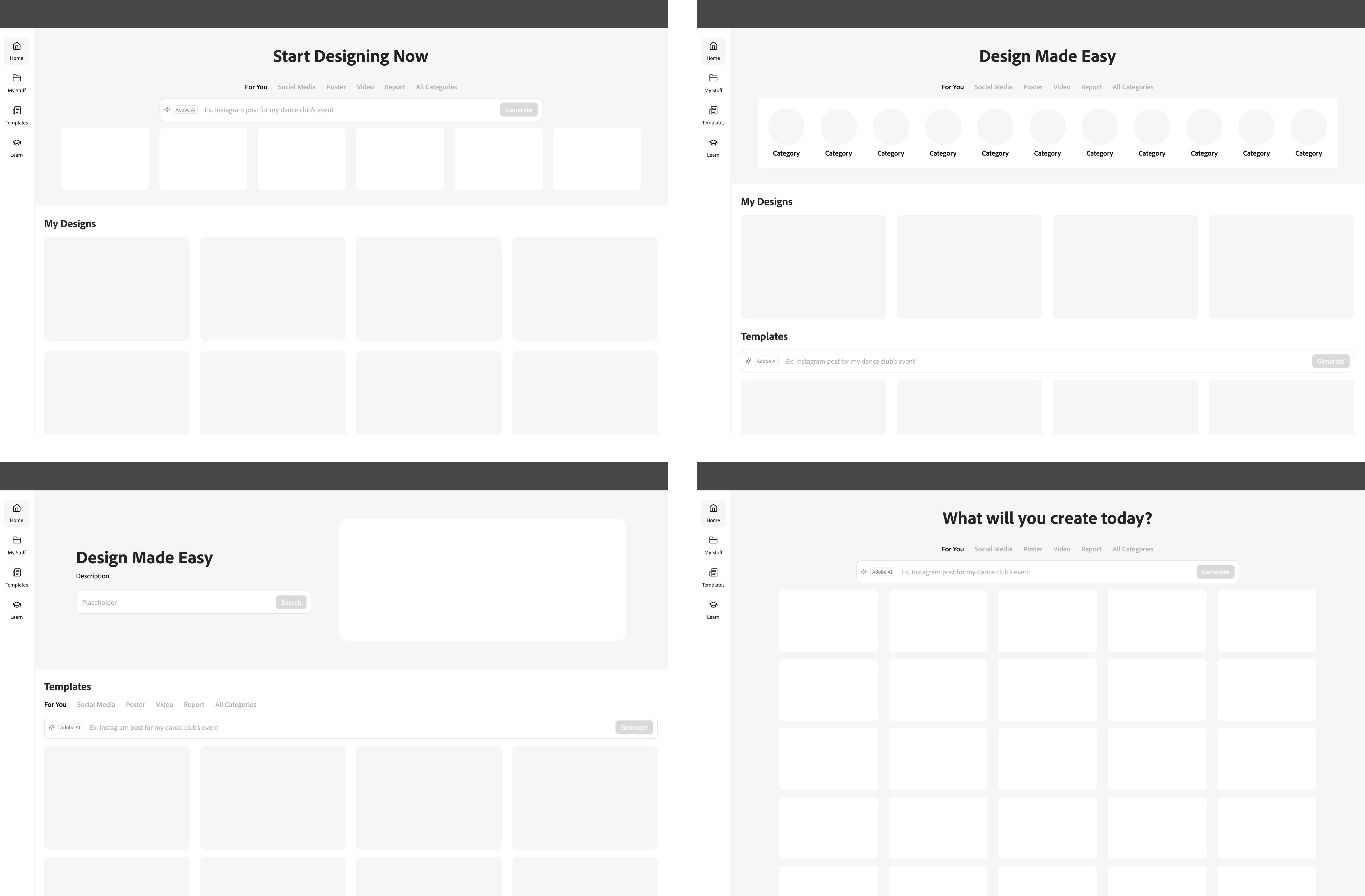
Workspace entry low fidelity wireframes
Final

Final workspace entry design

Before

After
Text Editor
Audit
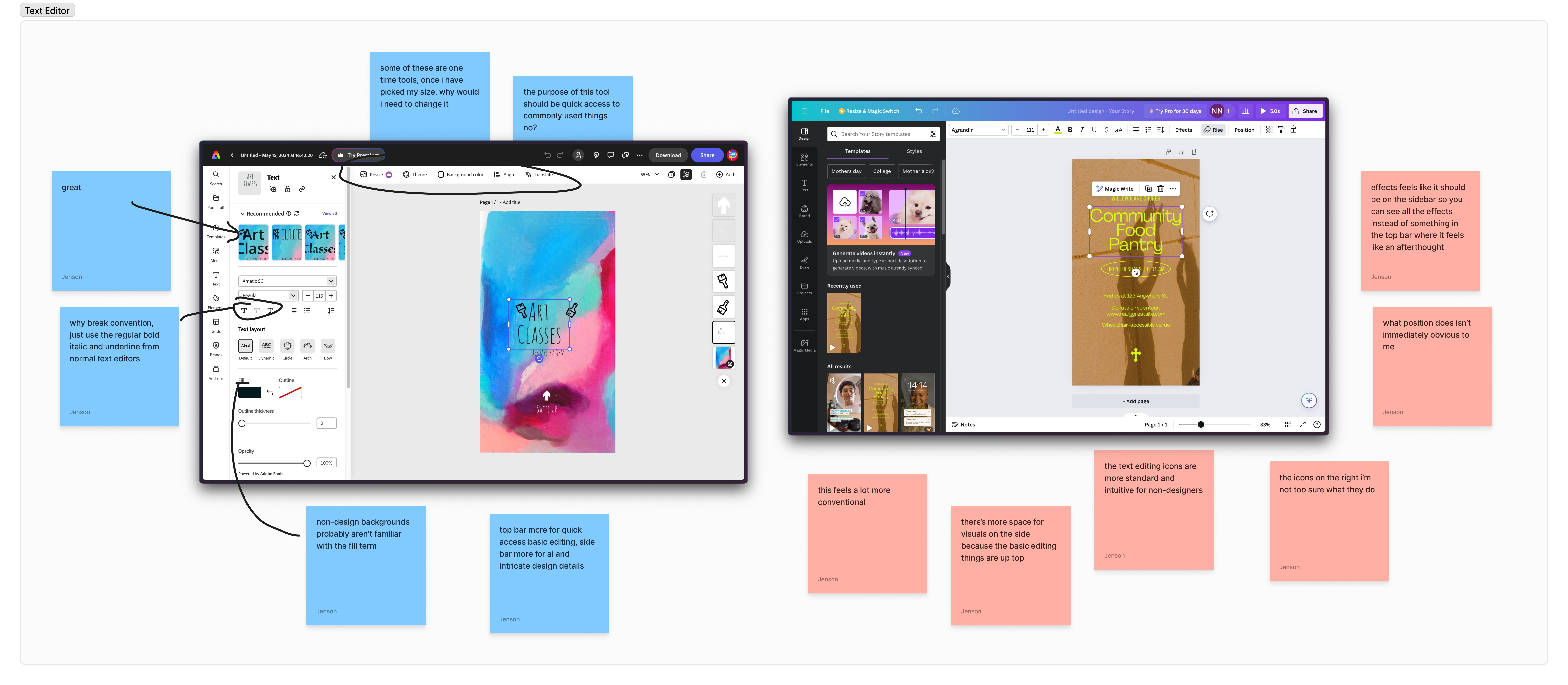
Text editor design audit
Key Takeaways
- Users often weren't sure where to look to edit text properties.
- The text editing controls unnecessarily broke convention in terms of icon and terminology usage.
- Express-unique text editing features weren't discoverable enough i.e. text effects, AI recommendations, etc.
Supporting Quotes
"I think editing the text on my flyer was a bit overwhelming because there was so much going on."
"I would prefer a horizontal bar for text editing."
"I think they need to specify what each icon means ... It's kind of frustrating that I have to click to find out."
"It's hard for me to figure out where the color change is."
"This AI font recommendation is really cool ... super useful"
Ideation
In our design process, we looked to industry standards to ensure that our redesign felt intuitive and familiar for first-time users. We wanted to ensure that whatever tools users were coming from, they'd be able to quickly pick up how to change all the basic text properties.

Microsoft Word text editing controls

Google Docs text editing controls

Canva text editing controls
We also wanted to take advantage of the extra screen real estate on the sidebar to show off Express' unique text editing features like the textures, layout options, movement effects, etc. in a more visual way.
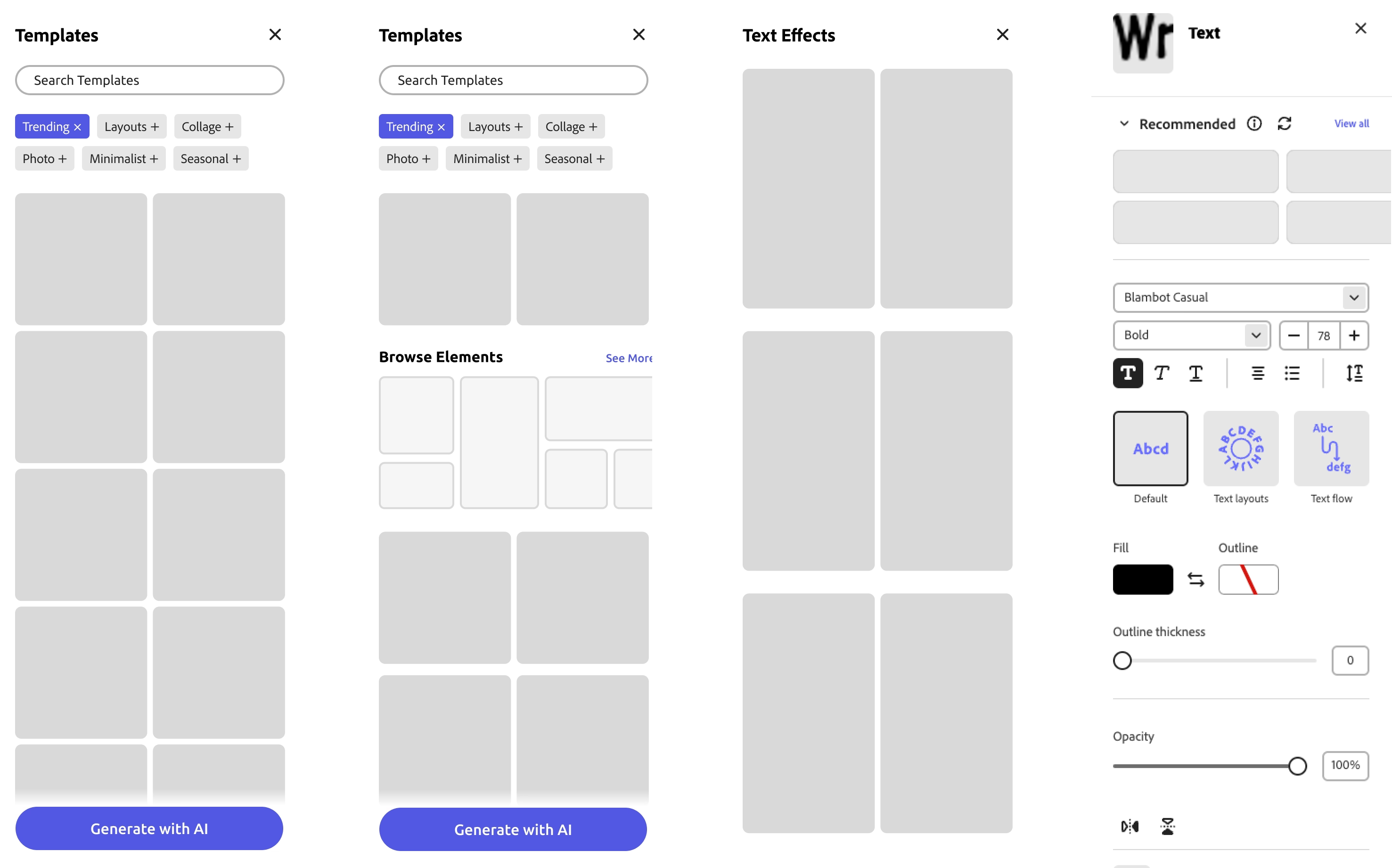
Sidebar low fidelity wireframes
Final

Final text editor design
In our final design recommendation, there's an easy distinction in control where the top bar contains all the essential tools (size, color, weight) and the side bar contains all the flourishes (effects, textures, and layouts).
Comparison

Before

After
Lessons Learned
Conclusion
This Adobe project was my first time working with other designers in a professional setting and it was always so interesting to see how everyone's differing backgrounds gave them unique insights and perspectives. I'm immensely grateful for this opportunity and felt that it made me grow so much as a designer and collaborator. Here are my biggest takeaways:
1. Research research research: As someone who loves the visual side of things, it's far too easy to want to immediately dive in the deep end and start messing around in Figma. If I had done so for this project, however, I would have ended up in a completely different direction with unactionable and misguided recommendations. It can never hurt to understand the context, the problem space, the users, and the perspectives of involved stakeholders more. Plus, crunching numbers and doing user interviews can be kinda fun!
2. Being a good designer is just as much about communicating as it is about designing: Having designed mostly solo in the past, it had never occured to me how much design was about justification. Getting your design decisions questioned relentlessly is a scary thing, but it helps you learn quickly to be conscious of your decisions, big and small.
3. Good design is a collaborative effort: Different people offer unique insights shaped by their personal experiences and perspectives. Coming together and combining these insights ultimately leads to different (i.e. BETTER) design decisions. Finding the right design can feel hard in a team, but it is infinitely harder by yourself.