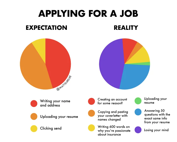
Job Application Expectation vs. Reality
For college students in the U.S. like me, internship recruitment season is finally coming to a close.
As of this morning, I've applied to 549 different intern roles, which means I've filled out A LOT of forms. And just like there are bad buttons, there are also bad forms.
For the purpose of job applications, Simplify has helped a lot in making filling out forms en masse more bearable. But forms aren't just for job applications, they're everywhere on the web. Contact forms, login pages, checkout flows, and surveys are just some of the many places where we use forms.
So, how do we make a form that doesn't suck?
Content
Before we even start talking about implementing the form, we need to start with the content. And for that, we should split the content into 2 categories:
Categories of Form Content
- Things I absolutely need
- Things that shouldn't be included i.e. everything else
Making users fill out unnecessary information is a loss all round. As a user, it takes me longer, it's more annoying, and I probably won't even fill it out if it's too much of a hassle. As a distributor of the form, I get less people filling out my form which means less of the information I need.
This seems obvious, but you'd surprise how often a form field leaves you thinking: why? Using the job application example, all a company really needs is an email, a resume, and general legal stuff (requirement for sponsorship, disability information, etc.), that's it.
Not to hate again on Workday, but it's a good example of form implementation making a real world difference. According to this article by Simplify:
Workday vs. Competitors
Form Dropoff
So, rule #1: keep it simple.
Form Design
Now that you've decided what fields should go into your form, it's time to start building it! Before getting into the nitty gritty of labels and inputs and all of that, let's think about the overall structure first.
To help with explaining, here's a skeleton of a typical job application form:
Welcome
Sometimes, there will be a splashscreen like this preceding the actual form fields.
There are a few things I'd like to call out here.
For starters, this form is too long! Having to fill out six screens before submitting is a big committment, and dropoff for a form like this is likely to be high, so avoid this if at all possible.
Sometimes, though, there are cases where you do need to a long form, like when collecting tax, legal, or insurance related information. In that case, our skeleton here is missing something super important: a progress indicator.
A good progress indicator plays a big role in the user experience for a couple of reasons.
Progress Indicator Role
- It sets expectations - People want to know what they’re getting into. A clear visual guide helps them understand how many steps are involved and how far along they are.
- It boosts motivation - Breaking the form into smaller steps helps them feel like they're making progress faster.
- It reduces dropoff - Without any feedback or sense of direction, long forms feel endless, causing users to jump ship.
Here's a good example of one from IBM's popular Carbon Design System.
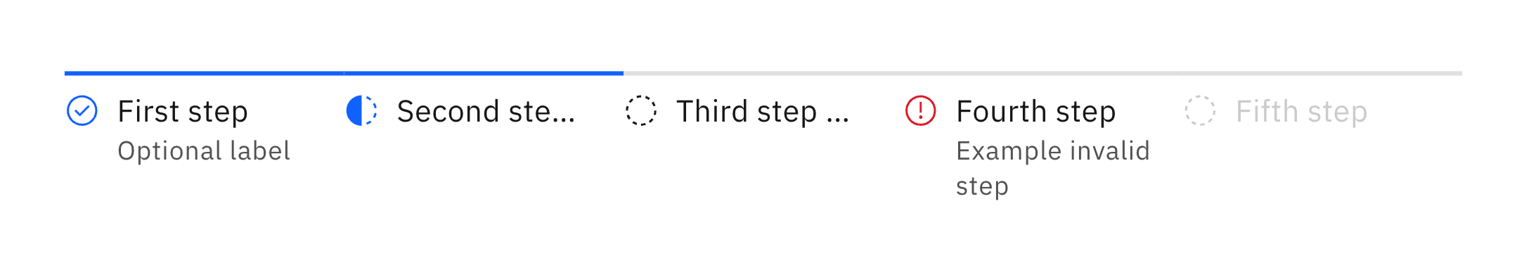
Progress Indicator from Carbon Design System
All of that critique aside, our skeleton does actually get some things right!
For one, the movement from section to section is direction aware (not a big deal but a fun detail nonetheless)! More importantly though, there is clear navigation and call to action. For a multi-step form like this, it's important that users can go back to make edits if needed and that they know how to move forward.
Again, this seems like a simple and common sense idea, but here's an example that doesn't give a clear next step:
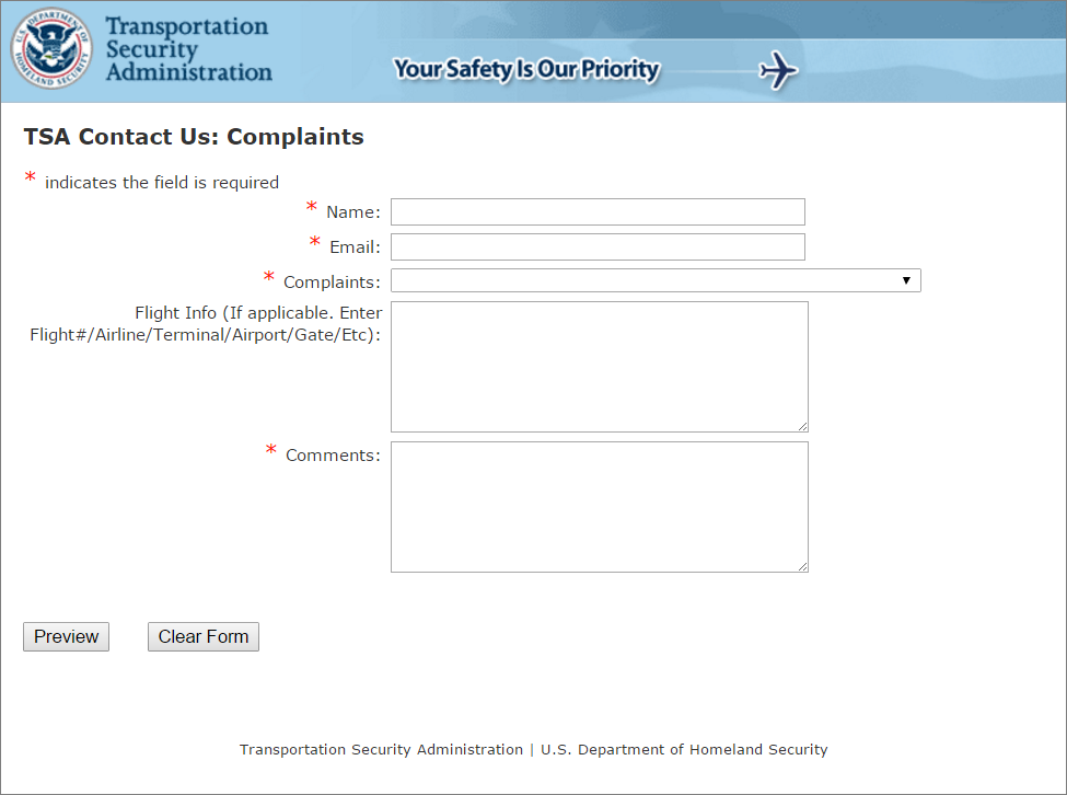
Complaint Form from TSA
Luckily, though, this form has since been redesigned and updated. Good job TSA!
Labels and Placeholders
At this point, we've got the content and structure down, so we can start thinking about how users are actually going to be interacting with our form. We'll get to different kinds of input in a bit, but let's start with labels and placeholders.
Here we have a naked input. Clearly, this isn't enough information for the user, so we'll have to label it somehow.
Out of these three methods, it's typically best practice to go with the third and vertically stack the label and input.
In isolation, the first method is okay, but in practice, when there are multiple input fields, we want to avoid having user attention traveling in a zig zag direction (label, input, label on the next line, input on the next line, etc.).
The second method seems okay at first, but the placeholder dissapears once the user starts typing, making it difficult to review and/or double check your inputs.
As for placeholders, they should be used carefully and purposefully.
Placeholders can be super useful in providing hints about the expected format of an input, like this email input above. However, it's important to remember that placeholders are not replacements for labels.
For the developers
If you're tasked with implementing a form, make sure that both your labels and placeholders meet accessibility standards. For labels, don't forget the htmlFor property to help screen readers identify the input field. For placeholders, ensure that the grayed out text has enough contrast with the background.
As sort of a hybrid implementation, the input component from Google's popular Material UI library transforms the placeholder into an input, which also works.
Keyboard Control
This section is typically overlooked but allowing for good keyboard control is a great way to improve the user experience. This isn't just for the tech nerds who know all the keyboard shortcuts, it's crucial for accessibility.
If you click on any of these inputs, you can use the Tab and Shift + Tab shortcuts to navigate between the fields. There is one field here, however, that stands out. The last field has no focus outline!
Often times, this is taken care of you by default if you're using the built-in HTML input or some input component from a library like shadcn. Sometimes people are tempted to remove this, but don't!
A fun fact is that you can actually style these focus outlines. If you're not a fan of the default blue ones, feel free to get creative (not too creative though, this animated rainbow is just a fun example to show you what's possible)!
Dropdowns
To continue on with keyboard input, here's an example of a dropdown that can be fully keyboard controlled.
When it's in focus, the Enter key expands the dropdown. You can then select with the up/down arrow keys and then Enter again to select the option. If you want to close it without selecting an option, press the Escape key. What's also neat is that while the dropdown is open, hitting Tab doesn't close the dropdown or select another component, the focus is contained.
As for dropdowns specifically, a big gripe I have is when there are too many options. In this example, it's fairly managable, but you could imagine how on a real application there might be hundreds or thousands of universities to choose from.
I think the best way to deal with this is to add search functionality. Another bonus tidbit that makes the user experience just so much better is to support flexible searching.
On most applications, my school's name is listed as "University of California, Los Angeles". With typical searching that requires perfect matching, forgetting the comma after "California" means it won't find the school. However, in this component, you'll see that I can search for "ucla", "cali", "la", or "university of california" and all of those search parameters will give me what I'm looking for.
Dates
Dates are another example of a common input type that can be tricky to get right. One of the biggest issues is that there are many different formats that people use to input dates.
Here's the date picker component from Material UI. I think holds up super well and has great user experience. It ticks all the boxes that we've talked about so far: a clear label, a meaningful placeholder specifying the date format, and good keyboard control support.
As a fun aside, here's a date input component I made that supports flexible input. It uses natural language processing to understand the user's input and convert it into a valid date. It supports a ton of different formats from more traditional ones like "08/09/2026" to more informal ones like "next thursday" or "3 days from now", try it out!
Detected Date:
The UX for this component isn't perfect. It can be confusing for users to know what to do next and error validation is a big question mark. However, it is a good exercise in thinking about how we can make our user interfaces more intuitive and flexible.
Error Validation
Speaking of error validation, this is the last thing I'll go over in this article. To demonstrate this, here's a classic email and password input you might see on something like a login page:
What's super fun about this particular example is that it supports inline validation. As you're typing, you'll see the focus outline color adjust based on the validity of the input. For the password field where there are multiple validation rules, you can see exactly which rules you're missing.
Especially on older forms, you'll see that lots of them don't have inline validation. Instead, they often rely on a submit button to trigger validation, which can be frustrating when you have to back through the form and look for errors.
When showing errors, also be sure to provide clear and concise feedback to the user. Telling a user "this password is invalid" is not much help if they don't know why and how to fix it. Here, we avoid that by explicitly showing each password requirement.
Conclusion
Forms can be notoriously difficult, tricky, and annoying to design and implement. Having to juggle all of the different considerations I've outlined above can be overwhelming, but ultimately forms are a fundamental part of the web experience, and it's important to make them as user-friendly as possible.
Little optimizations like these can easily be overlooked and brushed to the side, but in the end, they add up and can make a big difference for end users - I, for one, sure would have wished all the forms I filled out were like this...