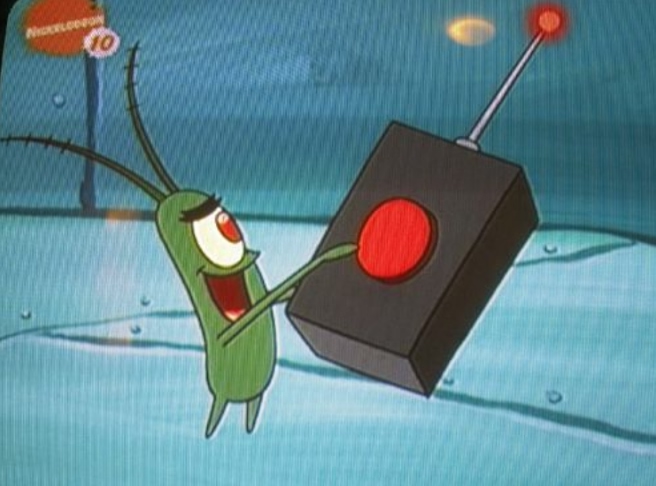
Plankton's Big Red Button from Spongebob
I don't know about you but that looks like a button I wanna press. If there was a big "DO NOT PRESS" sign underneath it, even better.
This, on the other hand, which is the default HTML button element, isn't as fun.
On the web, everything we do is controlled by buttons - everything from ordering a late night snack to confirming a bank transfer. They're on pretty much every page of every website, and yet, none of them are much fun.
So, how do we make a good button: one that you can't stop pressing.
Clickableness
When we think about styling on the web, we tend to think about size, color, and other aesthetic characteristics. It's important to realize, however, that a button isn't a purely aesthetic element, it's a functional one.
Users won't click a button if they don't know they can, so it's important to emphasize the functional aspect of it. In his book, The Design of Everyday Things, Don Norman popularized the idea of affordances in design.
Affordances represent the possibilities in the world for how the agent (a person, animal or machine) can interact with something.
As an example, compare these 2 buttons below:
Is this even a button?
This, on the other hand, which is stolen from Josh Comeau (check out his article here if you want to learn how to make it), affords you the ability to click.
In the default button we saw earlier, we draw a border and change the background to provide this affordance. In links, we add an underline and make it blue.
In this button, we use depth. Just like in real life, the button sticks out a little, creating a shadow and letting you know that you can push it inwards.
Hover Effects
Another important element to affording the ability to click is the hover effect.
By doing so, we confirm the affordance.
In real life, when we have our fingertips on a button, the tactile feedback we get from touching it is enough. But on the web, we don't really get to touch anything, so we need some other method of feedback.
Here's a recreation of an interaction that's all over Wojtek Witkowski's site. It's more of a link than a button, but it demonstrates the point well nonetheless.
How fun is that?!
Buttons on the web aren't typically much fun, so even adding a small effect like that makes a huge difference. It makes your site memorable and makes the user want to click and keep exploring.
Something people also often overlook because they've grown so use to it is the cursor change on hover.
Each of these cursor changes has semantic meaning that makes a big difference in getting your user to understand how to interact with your product, even if they don't always realize consciously realize.
Feedback
When users actually click the button, we want to give even more confirming feedback.
Especially if whatever our button does takes a while, we need to continually provide users with reassurance that it's working.
The button above loads for upwards of three seconds, which is long enough for a Gen Z-er to leave your site. But, by introducing some movement and giving continuous feedback, it turns an annoying delay into a delightful interaction.
Not doing so is not only not fun, it's frustrating. If you've ever been installing an app or playing a game and the loading screen is stuck at 99%, you know exactly what I mean. You've got no idea if it's actually working and more importantly, no idea how to fix it.
Conclusion
Now you've got all the tools and knowledge to make some good buttons. The details I've outlined above might seem like pedantic nit picks. But, it's my belief that added together, they make a huge difference in a user's overall impression and experience.
If you ever find yourself a good button, make sure to take a few minutes studying it. And if it's really good, steal it.