As a designer, knowing how to effectively use Figma's auto layout feature is a must.
I still remember the first time that I toggled it on for one of my components. I remember how magical it was, how amazing, but equally, how confusing 🤔.
It was only after some YouTube tutorials and lots of practice that I was truly able to get the hang of it. At this point, it's a tool I use every single day and one I can't imagine not having. But for the longest time, I never actually understood how it worked.
It was only when I began to learn more about web development and the technical side of things where I gained a full appreciation for the inner workings of auto layout. And today, I'd like to share some of that with you.
Intended Audience
This article is primarily written for designers with no technical background so don't worry if you've never coded before 😊.
Background
Before we start, let's think about why we even need auto layout in the first place? What problem does it solve? What user need does it fulfill?
As mobile technology continues to develop, we as designers need to accomodate for an increasingly wide range of displays, resolutions, and aspect ratios.
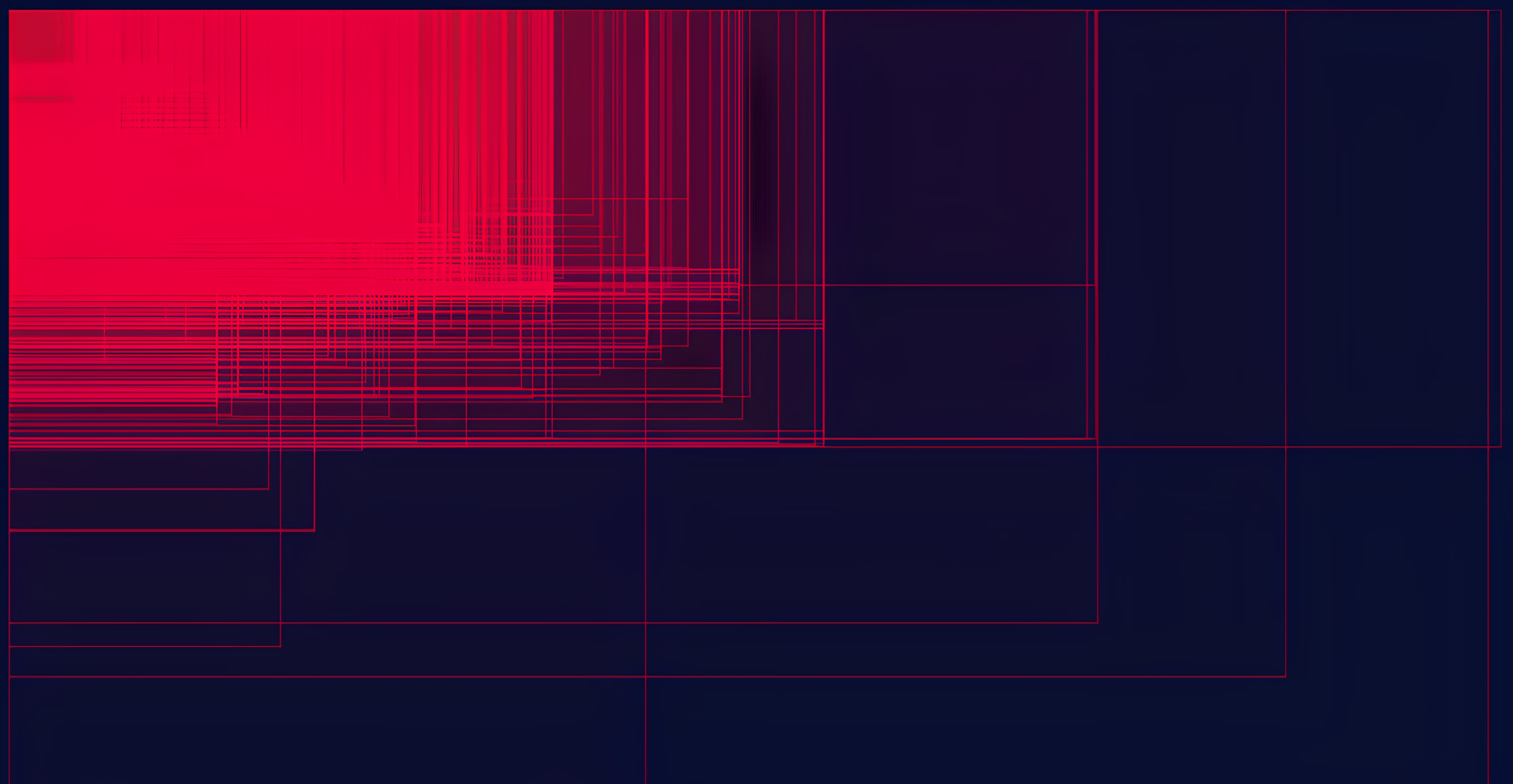
Visualization From Mattias Ott
This is a visualization made by Mattias Ott that demonstrates the sheer amount of viewport sizes that demand consideration in modern web and product development.
Every few years, new devices are added to this list. It used to be just desktop computers, then came laptops, then tablets, smartphones, smartwatches, folding phones, AI pins 😶, so on and so forth.
A still shot exported from Figma just simply isn't enough anymore. Modern design requires responsiveness, resilience, and adaptability.
If you've browsed the web enough, you're sure to have come across a couple bugs, regardless of the device you're using. Overflowing pictures, cut off text, overlapping touch targets, abnormal font sizes, and unresponsive navigation are all par for the course when designing and developing without responsiveness in mind.
Auto layout, and it's underlying implementation, flexbox (more on this later), are tools created to help us with building this resiliency in our designs. As the name suggests, it helps us make our designs flexible.
Laying The Groundwork
So, now that we know the why, how does it actually work under the hood?
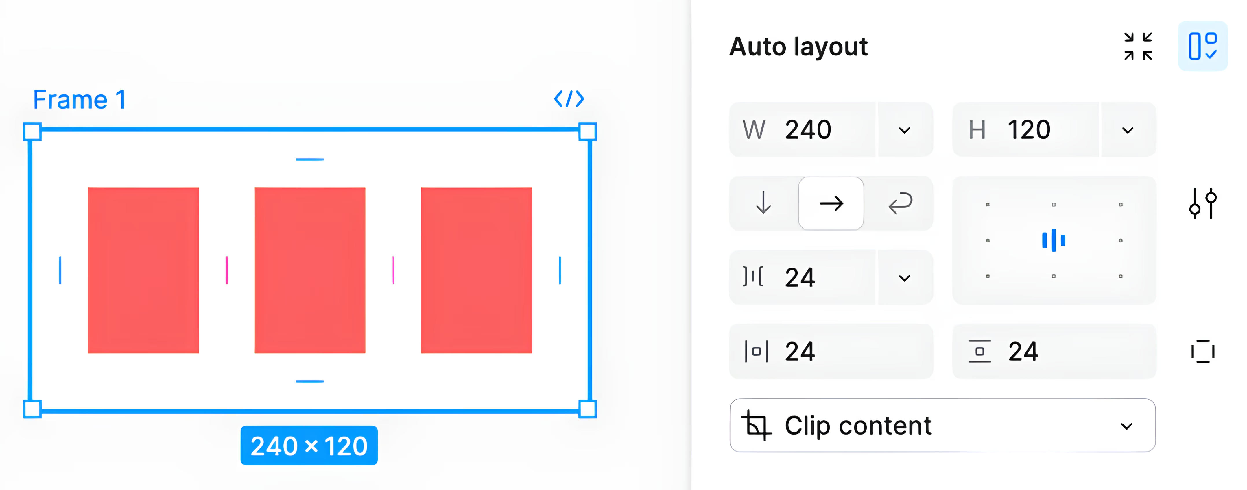
Figma's Auto Layout Interface
Essentially, Figma's auto layout feature provides a graphical user interface for interacting with CSS flexbox and its properties.
For non-technical readers, that high level overview alone may already be a little confusing, so let's break it down. If this is review for you, feel free to skip.
Inner Workings
Because this article is written for designers, I'm gonna go through the controls that are relevant in Figma, explain what they do, and how they're actually implemented.
Key Topics
- Layout
- Direction
- Alignment
- Gap
- Dynamic Sizing
Layout
First, let's try to understand what happens when you turn on auto layout.
When you first enable it in a component, you'll typically see some of the elements snap to certain positions and the bounding box resize.
The reason this happens is because the items are switching from absolutely positioned to flexibly positioned. In CSS we use the "display" property to control an element's positioning like this:
1display: flex;
1display: flex;
By default, everything in Figma is absolutely positioned, which means you define exactly where each element is. Each element is a standalone entity, and it's position doesn't depend on the existence or position of any other elements.
This is in contrast to when items are controlled using auto layout. Try clicking to delete the elements in the demo below and check out the difference between absolute and flexible positioning.
As you can see, auto layout makes your design flexible by allowing for reactive sizing and positioning.
In Figma, turning on auto layout creates a Frame around all of the elements you selected. In CSS, this frame is called a flex container, and the elements inside are flex children.
By changing properties on the container and its children, it gives us the power to do all sorts of fun layout stuff.
Direction
The first thing we can do is change the direction we want our items to be aligned.
In Figma, we do this by selecting between the different arrow icons.
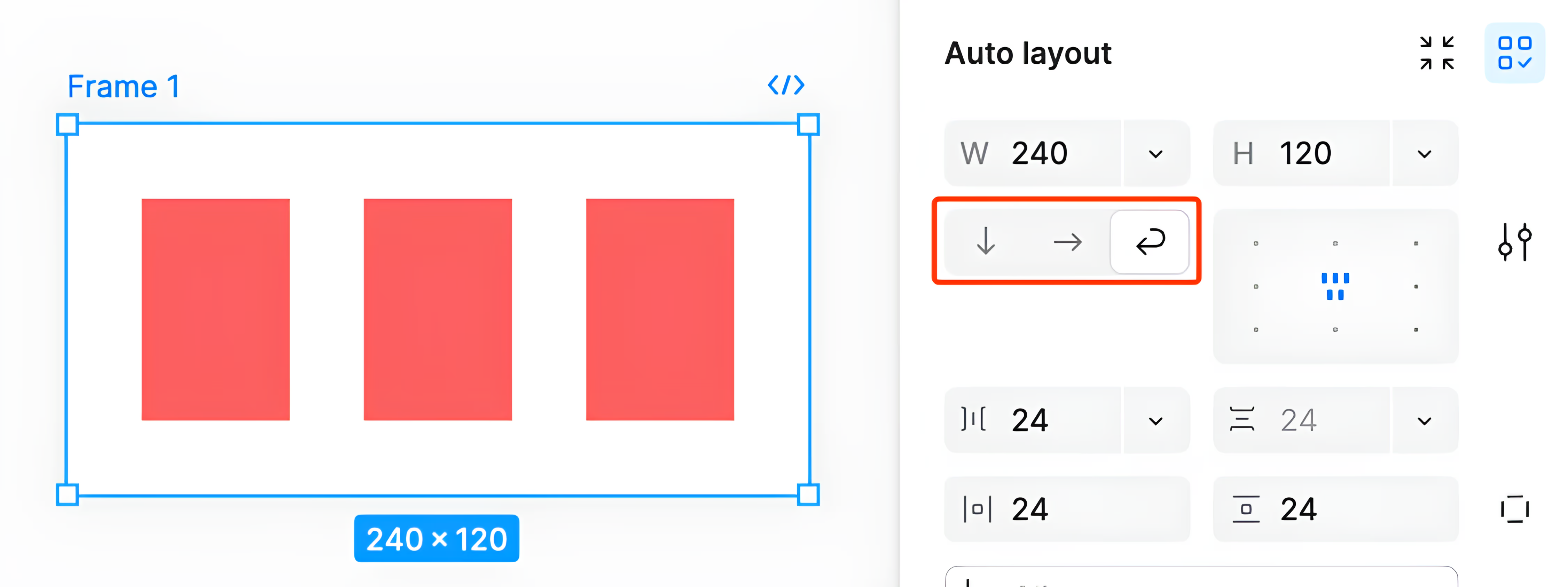
Figma Autolayout Direction Controls
In code, this is controlled by setting the flex direction property.
1flex-direction: row;
2flex-direction: column;
1flex-direction: row;
2flex-direction: column;
1
2
3
4
I'm skipping the 3rd wrap option here for now, but we'll get to it in a bit.
In our container, there are 2 axes that we can control our items along: the primary axis and the cross axis. The flex direction property controls the primary axis of our flex container.
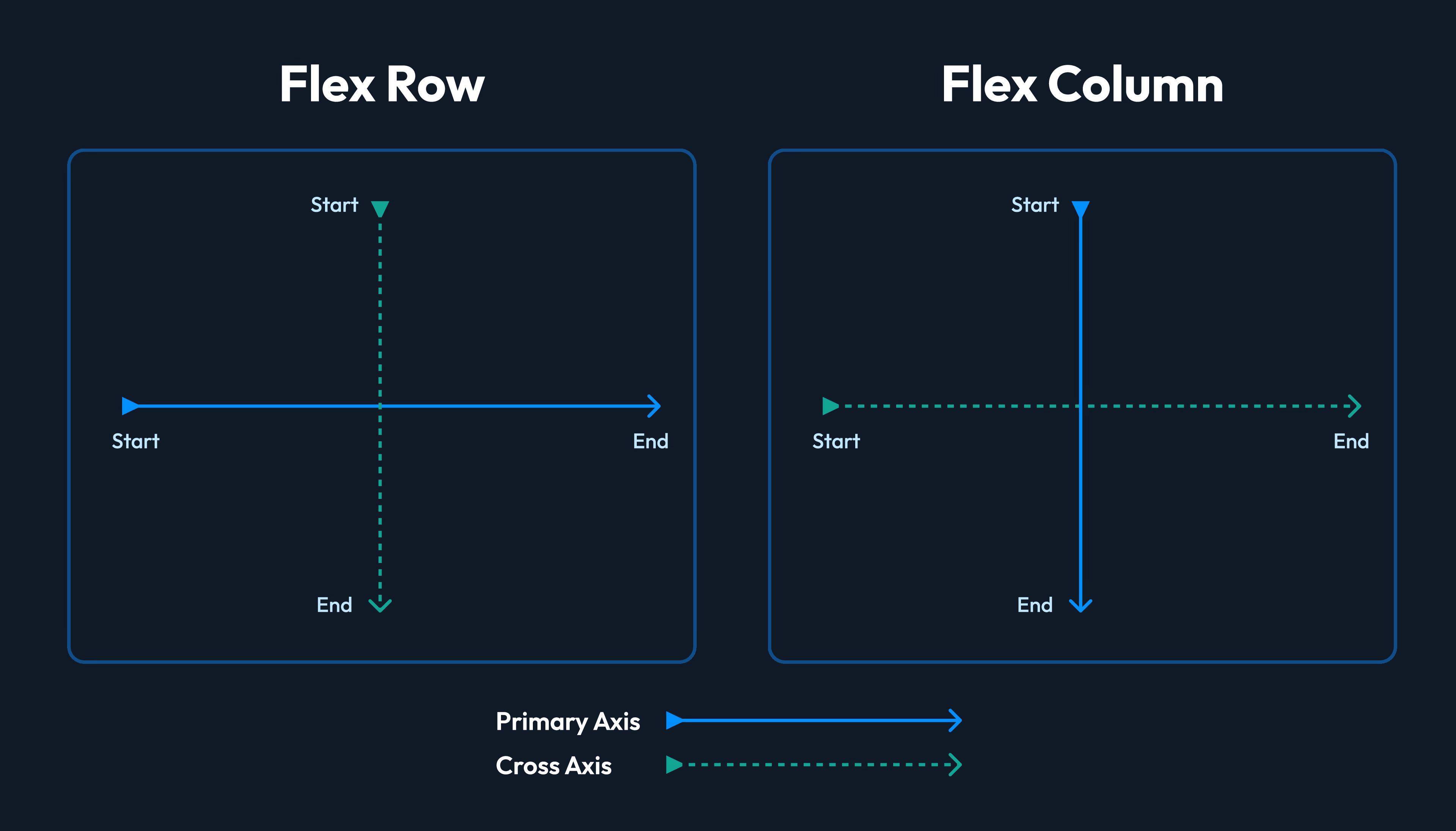
Flex Direction Graphic
With flex direction, we control whether our primary axis is veritical or horizontal, which is super important for controlling alignment.
Alignment
In terms of alignment, we've got 2 main tools to position our flex children.
To move across the primary axis, we use the justify-content property. For the cross axis, we have the align-items property.
1
2
3
In Figma's controls, we've got this 9 dot grid interface to control alignment.
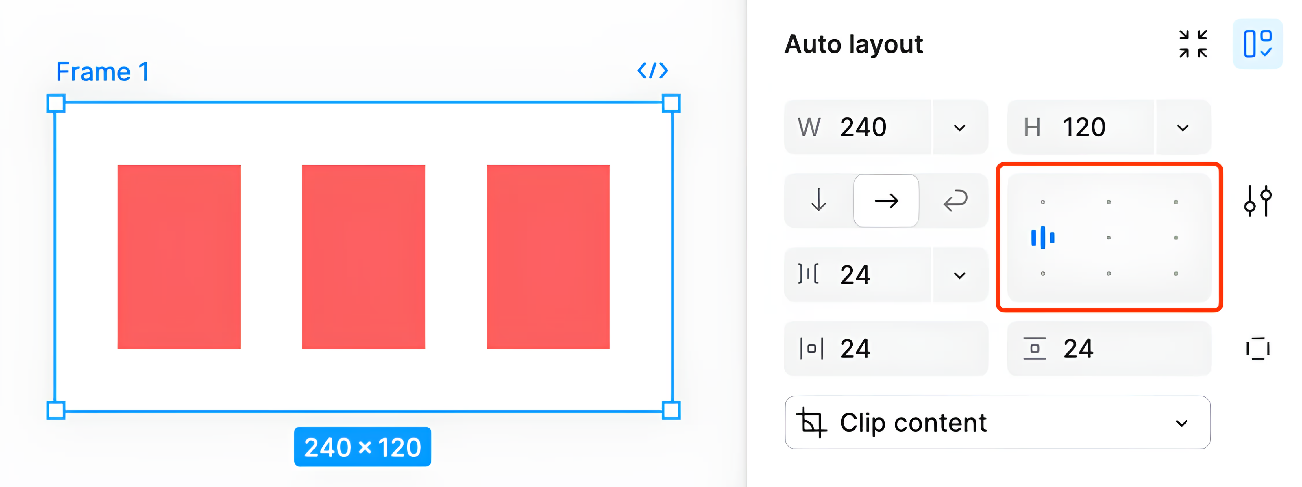
Figma's Autolayout Grid Alignment Interface
Here's what the corresponding code snippet would look like:
1flex-direction: row;
2justify-content: start;
3align-items: center;
1flex-direction: row;
2justify-content: start;
3align-items: center;
To spread the items across the container, you can double click the selected grid dot.
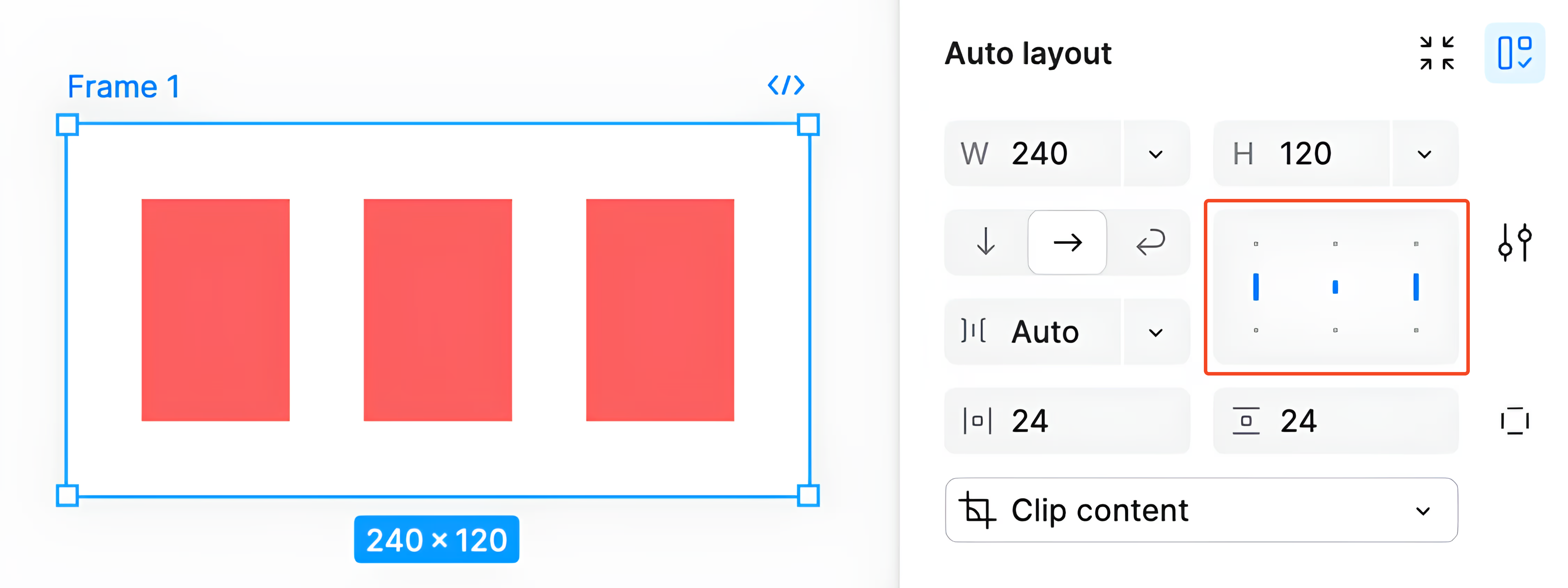
Figma Autolayout Stretched Items Interface
Behind the scenes, this sets the justify-content property to space between, causing the first and last elements stick to the edges of the container and the rest of the items to be spaced evenly between them.
When doing this in Figma, you'll see that the gap property switches from an explicit numeric pixel value to auto.
Gap
The gap property is pretty self explanatory. By default, we'll use an explicit numeric value to represent how far apart we want our items to be spaced.
1
2
3
But, when we use the space-between option on the justify-content property, we're no longer able to set an explicit gap because the spacing is controlled for us dynamically.
Dynamic Sizing
The last and most important thing is how to tie all of these things together to create layouts that change size and layout dynamically.
In addition to everything we've learned so far, there's 2 more key concepts we need to know to truly make flexible designs: growing and wrapping.
Growing & Shrinking
In Figma, when an element is being controlled by auto layout, we're given an extra option for the width and height properties. Instead of setting an explicit weight, we can set it to fill.

Figma Element with Fill Property
By doing so, we let the element's width or height fill up whatever space is available to it. When the container gets bigger, the element's allowed to grow into the newly available space.
1
2
3
In code, this fill option is controlled by a couple properties.
Primary Axis
When we want an element to fill across the primary axis, we use flex-grow, flex-shrink, and flex-basis.
1flex-grow: 1;
2flex-shrink: 0;
3flex-basis: 0;
1flex-grow: 1;
2flex-shrink: 0;
3flex-basis: 0;
By default, elements don't grow because flex-grow is set to 0, and so they take up however much space is specified. By setting it to 1, we're telling the flexbox algorithm that this element is free to take up extra space.
There are some more technical intricacies that have to do with flex-shrink and flex-basis, but they aren't relevant to us. The takeway here is that this set of properties is what Figma applies when we use the fill option.
Cross Axis
When we want an element to fill across the cross axis, however, we don't control any flex properties. We actually use the align option. But, instead of using align-items like we saw before, this time we use align-self so it doesn't affect any of the other elements.
1align-self: stretch;
1align-self: stretch;
Wrapping
The last thing we need to talk about is wrapping, which, thankfully, is pretty straightforward. When our container reaches a size where our there is no extra space, we want them to wrap to the next line instead of overflowing out of the bounds.
1
2
3
In Figma this is grouped together with the direction controls.

Figma Autolayout Direction Controls
And in code, all we need to do is change the flex-wrap property.
1justify-content: row;
2flex-wrap: wrap;
1justify-content: row;
2flex-wrap: wrap;
Conclusion
That's it!
As designers, trying to learn more about code often feels like getting thrown into the deep end. It's uncomfortable and there's a huge learning curve...I know. So, I hope this article helped in making the technical side of things just a little bit more accessible.
I've left out a lot of the finer details of flexbox here, but if you'd like to dive deeper, I'd really recommend looking at some other online resources. But more importantly, try using it.
Jump on a CodePen or CodeSandbox and play around with some of the properties we learned about today. There's no better way to learn than to fail.
If you've made it this far, thank you so much! If you'd like to know when I post more articles or like this or just keep up to date with what I'm doing, subscribing to my newsletter down below is the best way to do so.
Also, if you've got any feedback or comments, feel free to reach out, I'm more than happy to talk!
Anyways, see you soon :)